
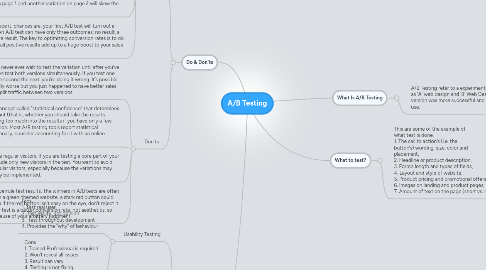
1. Pro & Cons
1.1. Usability Testing
1.1.1. Pros 1. Test real user 2. Test reality, not opinion 3. Test throughout development 4. Provides the "why" of behaviour
1.1.2. Cons 1. Trained Professional is required 2. Won't reveal all issues 3. Result can vary 4. Testing is not fixing
1.2. A/B Testing
1.2.1. Pros 1. Fast 2. Test Reality 3. Quantifiable 4. Accurate
1.2.2. Cons 1. Can hurt results 2. Missing the "Why" 3. Not predictive 4. Needs traffic
1.3. Alpha/Beta Testing
1.3.1. Pros. 1. Large number of testers 2. Live site Testing 3. Testing by real users 4. Can continually tweak
1.3.2. Cons 1. Must be built 2. Chaotic testing 3. Tester may not be end-users 4. Expose the secret sauce
2. Do & Don'ts
2.1. Do's
2.1.1. Know how long to run a test before giving up. Giving up too early can cost you because you may have gotten meaningful results had you waited a little longer. Giving up too late isn't good either, because poorly performing variations could cost you conversions and sales. Use a calculator (like this one) to determine exactly how long to run a test before giving up.
2.1.2. Show repeat visitors the same variations. Your tool should have a mechanism for remembering which variation a visitor has seen. This prevents blunders, such as showing a user a different price or a different promotional offer.
2.1.3. Make your A/B test consistent across the whole website. If you are testing a sign-up button that appears in multiple locations, then a visitor should see the same variation everywhere. Showing one variation on page 1 and another variation on page 2 will skew the results.
2.1.4. Do many A/B tests. Let’s face it: chances are, your first A/B test will turn out a lemon. But don’t despair. An A/B test can have only three outcomes: no result, a negative result or a positive result. The key to optimizing conversion rates is to do a ton of A/B tests, so that all positive results add up to a huge boost to your sales and achieved goals.
2.2. Don'ts
2.2.1. When doing A/B testing, never ever wait to test the variation until after you’ve tested the control. Always test both versions simultaneously. If you test one version one week and the second the next, you’re doing it wrong. It’s possible that version B was actually worse but you just happened to have better sales while testing it. Always split traffic between two versions.
2.2.2. Don’t conclude too early. There is a concept called “statistical confidence” that determines whether your test results are significant (that is, whether you should take the results seriously). It prevents you from reading too much into the results if you have only a few conversions or visitors for each variation. Most A/B testing tools report statistical confidence, but if you are testing manually, consider accounting for it with an online calculator.
2.2.3. Don’t surprise regular visitors. If you are testing a core part of your website, include only new visitors in the test. You want to avoid shocking regular visitors, especially because the variations may not ultimately be implemented.
2.2.4. Don’t let your gut feeling overrule test results. The winners in A/B tests are often surprising or unintuitive. On a green-themed website, a stark red button could emerge as the winner. Even if the red button isn’t easy on the eye, don’t reject it outright. Your goal with the test is a better conversion rate, not aesthetics, so don’t reject the results because of your arbitrary judgment.