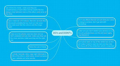
1. use a maximum of 3 colours, that suit. as more than this would probably be too much on one cover. also make sure that the colours suit the image used.
2. make sure the photos used are clear and are NOT pixleated and are clear. make sure they suit the cover and also make sure they are the right size.
3. don't use effects that do not suit what your cover is trying to achieve, don't go wild with photoshop
4. use 2 fonts (no more) . make sure they are complimentary of each other and be careful the the sizing is clear between name of the album and name of the artist .
5. follow the rule of thirds.
6. make sure you don't stretch your photos out as this will pixleate them and this will look highly unprofessional
7. dont place texts on top of the artists face as this will make it hard to read the text and also take the focus off of the artists face which is important.
8. include: barcode, date, copy right information, title of the album, artist name, record company logo, website and artist we site.