
Do's & Don't of ancillary products
by Neeka Renese
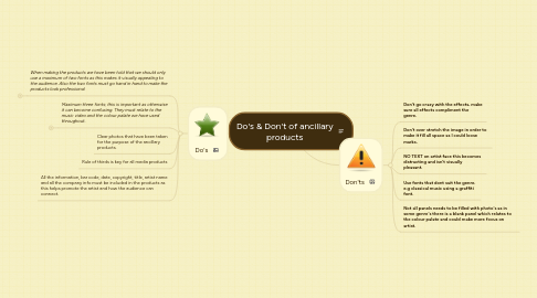
1. Don'ts
1.1. Don't go crazy with the effects, make sure all effects compliment the genre.
1.2. Don't over stretch the image in order to make it fill all space as I could loose marks.
1.3. NO TEXT on artist face this becomes distracting and isn't visually pleasant.
1.4. Use fonts that dont suit the genre. e.g classical music using a graffiti font.
1.5. Not all panels needs to be filled with photo's as in some genre's there is a blank panel which relates to the colour palate and could make more focus on artist.
2. Do's
2.1. When making the products we have been told that we should only use a maximum of two fonts as this makes it visually appealing to the audience. Also the two fonts must go hand in hand to make the products look professional
2.1.1. Makes content easier to read
2.1.2. Add an eyecatcher
2.1.2.1. e.g. Add a picture of the Spanish lottery winner
2.2. Maximum three fonts; this is important as otherwise it can become confusing. They must relate to the music video and the colour palate we have used throughout.
2.2.1. of grammar / spelling