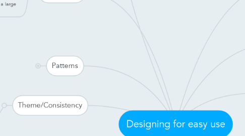
Designing for easy use
by Emma Rose


1. Design
1.1. Minimalist
1.2. Simple
1.3. Big pictures, not a ton text
2. Navigation
2.1. Why? Helps users quickly find what they need
2.2. Faceted taxonomy for searchinbg throuhg a large number of things.
3. Information architecture
3.1. structure of the info
4. Typography
4.1. Font size
4.1.1. should be relative rather fixed, it should be adjustable
4.2. line length
4.2.1. Why? People comprehend the best in medium line length - (50-70)
4.3. Typeface/font face
4.4. serif vs. san serif
4.5. DONT USE ALL CAPS
4.6. Only use underline for links
5. Theme/Consistency
5.1. Why? for branding, to give users confidence that they are on a respected site
6. Patterns
6.1. Agreed upon practices across sites
6.2. Banner/logo being clickable and linking to teh home
6.3. have a search box (top right)
6.4. footer: copyright, contact, job link, social media
6.5. checkout/shopping cart
7. Color
7.1. Why? Color blindness
7.2. Contrast
7.3. Should be balanced
7.4. Should not clash
8. Content
8.1. Words
8.1.1. Not long wordy paragraphs
8.2. Imagery
9. Home pages
10. Space
10.1. Prioritizing information
10.2. Allow users to quickly find what they need
10.3. Using a grid format
10.3.1. help with consistency
10.3.2. align
