10 Heuristics Evaluation for Aliexpress.com
by Samuel Ng
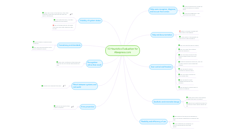
1. Consistency and standards
1.1. Search engine is always placed at the top
1.2. Title, price and description fonts are all in different colours
2. Error prevention
2.1. User are only able to type digits in Quantity
3. Match between systems and real world
3.1. Dresses icon represent the dress
4. Visibility of system status
4.1. When user clicks on the text box, it will start blinking to notify the user that the users are able to start typing
4.2. It will notify the users, if an item is added into the wishlist
4.3. The cart image logo will still show zero items even after adding an item to cart
5. Recognition rather than recall
5.1. When user is entering on the search box, there will be list of words typed before by user
6. User control and freedom
6.1. User can filter the search content
6.2. User can select the materials they are looking for
6.3. User can easily go back to the previous page if there is an error made
6.4. Under the keywords search bar, user can exclude a word to avoid unwanted content
6.5. User are able to leave a comment on specific items
6.6. User can share a product at social media sites
6.7. User are able to select language preferences and currency
6.8. User are able to choose sizes of a dress or materials
7. Help users recognize, diagnose, and recover from errors
7.1. It will prompt the user if they are unable to search for a certain items
7.2. It will give suggestion if the search has zero results
8. Help and documentation
8.1. There is no guide, to guide first time users in the website
8.2. A help center in the website for the users to seek assistance
9. Aesthetic and minimalist design
9.1. Image logos used in the website to direct the users is relevant
9.2. Search tools shows the amount of the specific items search results will be
10. Flexibility and efficiency of use
10.1. logo based on the words are designed so users can quickly understand by looking at the logo
10.2. Clear categories are designed, for users to quickly get an item they desire
