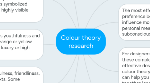
Colour theory research
by Sophie Vincent

1. Psychology of colour: Colour is all around us. Whether we realise it or not, it plays a big role in our everyday lives; especially when used in branding as people are automatically drawn to bright colours. Colour even creeps its way into language… why do we say people are “seeing red” when they’re angry or “feeling blue” when they’re sad? Because colour has a unique connection to our moods and emotions. But not everyone thinks about or experiences colour in the same way. The meaning and symbolism we associate with different colours are influenced a great deal by the cultural and societal groups we identify with. Let’s take a look at some common meanings associated with basic colours in Western culture:
2. Red: This colour can communicate many different ideas depending on its context. Because red is associated with fire, it can represent warmth or danger. Since red is also the colour of blood, it’s considered an energetic, lively colour and is also associated with matters of the heart, and sometimes violence. Alternate meanings: In some Eastern cultures, red symbolizes good fortune and prosperity and is the colour worn by brides on their wedding day. Worldwide, red has been associated with various political movements and has symbolized revolution. In branding: Red often communicates strength, confidence, and power and is a highly visible colour.
3. In branding: Orange often represents youthfulness and creativity. Gold, which is a type of orange or yellow depending on its hue, is a symbol of luxury or high quality.
4. Yellow: As the colour of sunshine, yellow often communicates happiness, cheerfulness, friendliness, and the freshness of spring. It can also signal warning or caution in certain contexts. Some variations (especially desaturated and greenish yellows) can look sickly or unpleasant; historically, yellow has sometimes been associated with illness and quarantine. Alternate meanings: In some Eastern and Asian cultures, yellow is associated with royalty or high rank. In parts of Africa and Latin America, yellow is the traditional colour of mourning.
5. Green: This is the colour of nature, plant life, and growth. As such, it often communicates health, freshness, or an “all-natural” quality. Dark green can represent wealth (or anything money-related) and stability. Alternate meanings: Among cultures that practice Islam, green is a sacred colour. Green is also associated with Ireland and, by extension, St. Patrick’s Day and lucky four-leaf clovers. In branding: Brands or a product that wants to come across as “green” (in the sense of natural, healthy, sustainable, environmentally friendly, organic, etc.) often use nature-inspired colours like green and brown.
6. Colours can also be paired by temperature (warm or cool colours), saturation (vivid colours often look youthful, while faded ones look vintage), mood (bright & fun, dark & serious), theme (location, season, holiday), and other qualities.Colours can also be paired by temperature (warm or cool colours), saturation (vivid colours often look youthful, while faded ones look vintage), mood (bright & fun, dark & serious), theme (location, season, holiday), and other qualities.
7. The most effective colour choices go beyond just personal preference because colours have an extraordinary ability to influence mood, emotions, and perceptions; take on cultural and personal meaning; and attract attention, both consciously and subconsciously.
8. For designers and marketers, the challenge is in balancing these complex roles that colour plays to create an attractive, effective design. That’s where a basic understanding of colour theory can come in handy. Traditional colour theory can help you understand which colours might work well together (or not) and what kind of effect different combinations will create within your design.
9. In branding: Pure/bright yellow does a great job of attracting attention, but can be visually disturbing or even hard to see (for instance, white text against a bright yellow background or vice versa) if not used with care.


