
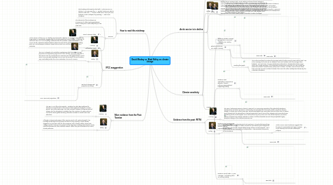
1. How to read this mindmap
1.1. Start reading clock-wise (so start with "Arctic sea ice is in decline"). You can press the "+" symbol to discover what is inside a node and "-" to hide a lower level. Once you have finished a node, collapse it by pressing "-" and move clockwise.
1.2. Sources
1.2.1. The elements of this mindmap are summaries of a letter exchange between David Mackay and Matt Ridley that you can view here
1.2.2. David MacKay's letter
1.2.2.1. -
1.2.3. Matt Ridley's reply
1.2.3.1. -
2. IPCC exaggeration
2.1. MacKay
2.1.1. While criticism of the IPCC is a healthy part of scientific debate, it is unjust to imply that the organisation is consistently exaggerating the threat posed by climate change. In the case of sea levels, the IPCC has if anything underestimated the problem. Initial calculations in the IPCC’s Fourth Assessment Report failed to take into account the consequences of melting polar ice, and subsequent research shows that sea level rise is at the upper end of IPCC estimates.
2.2. Ridley
2.2.1. The IPCC is biased and unreliable, emphasising data that serves its own purposes and suppressing arguments to the contrary. The IPCC does not in fact seem to be very conservative on sea-level rise: the graph shows a rise of only 3.1mm per year, equating to 31cm over the course of the 21st century – very comfortably within the IPCC’s estimates of a rise of 18-59cm.
2.3. Sea level changes and projections (Mackay)
2.3.1. IPCC Sea Level projections
3. More evidence from the Past: Toarcian
3.1. MacKay
3.1.1. The PETM is not the only example – evidence has also been gathered to describe an event known as the Toarcian that happened during the Jurassic period, 183 million years ago. This also involved a release of huge amounts of carbon into the atmosphere, probably from the eruption of a super-volcano, and led to severe global warming, dramatic increases in rainfall, and mass extinction.
3.2. Ridley
3.2.1. Although not previously aware of the Toarcian event until Mackay brought it up (Mackay himself says he only found out about it very recently), a quick review suggests it is not a slam-dunk for the consensus. But it clearly needs a closer look. Anyway, wouldn't it be nice to go back to the days when exciting paleoclimatic events could be discussed for their scientific interest, rather than just as evidence for current climate patterns?
4. Arctic sea ice is in decline
4.1. MacKay
4.1.1. Compelling data shows that Arctic sea ice is in rapid decline. Over the past decade, the ice extent has been strikingly lower than the average for the preceding 20 years. During summer 2010, the ice extent was about four standard deviations below the 1979-2000 mean. The summer ice extents for the years 2007-2009 were all more than two standard deviations below the mean.
4.2. Ridley
4.2.1. Arctic sea ice is a weak example. The unprecedented drop that the data seems to show in fact reflects the limitations of its scope in only going back as far as 1979. Going back further would show a far less alarming picture of natural rises and falls in the ice extent – there is a lot of anecdotal evidence that the ice retreated just as much during the 1920s and 30s. In any case, even a dramatic reduction in the ice would not have serious consequences for either humans or polar bears.
4.3. Extent of arctic sea ice, recent (MacKay)
4.3.1. New node
4.3.2. Reading this graph
4.3.2.1. The continuous black line shows the average extent (surface area of ocean with at least 15% of ice covering it) of arctic sea ice between June and October, with the average taken between 1979 and 2000. The grey shaded area shows the 2 standard deviations range - which can, loosely speaking - be interpreted as being the range that it is very unlikely we would fall outside if variation were purely due to chance. The 2007 and 2010 lines show how much less summer ice there has been than even the rather unlikely band shown by the 2 standard deviations
5. Climate sensitivity
5.1. MacKay
5.1.1. The sceptical position is based on a certainty that doesn’t exist. Sceptics must assume that increasing CO2 will cause only a small rise in temperature of around one degree, but most research suggests that there is likely to be a bigger increase. Even assuming only a one degree increase, those alive in 2100 will be living in a world two degrees warmer than it is today. This hotter climate will be more volatile and harder to live in.
5.2. Ridley
5.2.1. But the rise is running at just 1C per century, and even that is looking at adjusted rather than straight-forward raw data. The warming is really going to have to get going if we’re going to have a 3C century. But the real question is not the rise in temperature, but its effects. Even if the world gets significantly warmer, the outcome may not be anywhere near as dire as the IPCC predicts. Some research shows that even increases of up to 4.5 degrees will have only fractional effects. There is even evidence to show that a two-degree rise in temperature could leave fewer people vulnerable to water shortages.
5.3. Graphs
5.3.1. Evidence: Global Average Temperature 1850-2009 - towards a 2C century (Mackay)
5.3.1.1. New node
5.3.2. Evidence: Raw Speleothem Temperature Records - there is nothing unprecedented happening (Ridley)
5.3.2.1. New node
5.3.3. Evidence: Last 10,000 years Interglacial Temperature - there is nothing unprecedented (Ridley)
5.3.3.1. New node
5.3.4. Evidence: Rural/Urban 11 year Averages - not looking like a 2C century (Ridley)
5.3.4.1. Raw data
5.3.4.2. 'Adjusted' data
6. Evidence from the past: PETM
6.1. MacKay
6.1.1. The PETM (Paleocene–Eocene Thermal Maximum) is a convincing example of the potentially disastrous consequences of carbon emissions. Sedimentary rock samples from the North Atlantic reveal an extreme change in climate 55.8 million years ago. Paleoclimatologists have concluded that one trillion tons of carbon were released into the atmosphere, causing temperature rises of around four degrees and mass extinctions. Something similar could happen to us if we continue to pump more CO2 into the atmosphere; at present carbon emissions have already reached 0.5 trillion, half the estimated amount that precipitated hugely disruptive change in the Paleocene-Eocene era.
6.2. Ridley
6.2.1. The PETM example is interesting but not conclusive. It may be that something other than a dramatic CO2 increase caused the rapid warming that happened at this time. The climate change lobby’s heavy reliance on this example – 55.8 million years old and uncertain in its implications – demonstrates the paucity of their evidence.
6.2.1.1. What is more, recent evidence suggests that the period is associated with large increases in bio-diversity, and not with catastrophic collapse