
1. container
1.1. justify-content
1.1.1. [ flex-start | flex-end | center | space-between | space-around ]
1.1.2. 주축에 따라 항목을 맞추는 방법을 설정
1.2. align-items
1.2.1. [ flex-start | flex-end | center | baseline | stretch ]
1.2.2. 교차축에 따라 항목을 맞추는 방법을 설정
1.3. align-content
1.3.1. [ flex-start | flex-end | center | space-between | space-around | stretch ]
1.3.2. justify-content와 유사하나 여러줄이 있을 경우 정렬을 설정
1.4. flex-direction
1.4.1. [ row | row-reverse | column | column-reverse ]
1.4.2. 기본축의 방향을 설정
1.5. flex-wrap
1.5.1. [ nowrap | wrap | wrap-reverse ]
1.5.2. 자식요소를 단일 또는 복수행이나 열로 줄바꿈할지 결정
1.6. flex-flow
1.6.1. [ flex-direction | flex-wrap ]
1.6.2. 단축형 속성
2. Description
2.1. 변천사
3. Bookmark
3.1. Generater
3.1.1. 구버전도 제공
3.2. slide
3.3. Link
3.3.1. 유연한 상자 레이아웃
3.4. Video
3.4.1. Leveling Up With Flexbox
4. Bug
4.1. CSS flex: Webkit, Android 2.1~4.3, IE 10 문제 해결.
4.2. flex bug 모음
5. 다른 항목을 기준으로 축소되는 방법을 제어
6. items
6.1. order
6.1.1. [ integer ]
6.1.2. 아이템의 순서를 제어 ex) 1,2,3
6.2. flex-grow
6.2.1. [ number ] * default 0
6.2.2. 다른 항목을 기준으로 확대되는 방법을 제어
6.3. flex-shrink
6.3.1. [ number ] * default 1
6.4. flex-basis
6.4.1. [ length ] | auto * default auto
6.4.2. 항목의 초기 기본 크기
6.5. flex
6.5.1. [ flex-grow | flex-shrink | flex-basis ]
6.5.2. 단축형 속성
6.6. align-self
6.6.1. [ auto | flex-start | flex-end | center | baseline | stretch ]
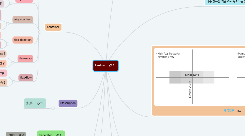
7. 제목없음
7.1. align-items를 재정의
7.2. 주축 : Main Axis
7.3. 교차축 : Cross Axis
7.4. direction 속성값에 따라 주축과 교차축은 변함
8. 속성값 이해 between : 중간에, around : 주위에
9. Support
9.1. 2009 syntax - display:box
9.1.1. android 4.3이하(Stock브라우저)
9.1.2. iOS 6.1이하
9.1.3. Chrome 20이하
9.1.4. Firefox 21이하
9.2. Final syntax - display:flex
9.2.1. android 4.4이상
9.2.2. android 4.3이하(크롬브라우저)
9.2.3. iOS 7.1이상
9.2.4. internet explorer 11
9.3. 2011 hybrid syntax - display:flexbox
9.3.1. internet explorer 10