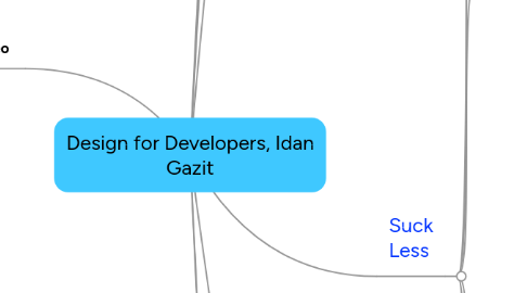
1. slides & video
1.1. http://www.scribd.com/doc/32311867/Design-for-Developers
1.2. http://djangoconeu.blip.tv/file/3685673/
2. typographyforlawyers.com
3. Google home-page
3.1. vs. Yahoo! / MSN
4. tag-line
4.1. making your front-end suck less
5. About
5.1. @idangazit
5.2. [email protected]
5.3. developed
5.3.1. django-advent
5.4. organized / designed
5.4.1. (Euro)DjangoCon
6. Why
6.1. design is a necessary capability of Web designers
6.1.1. provide better user experience
6.2. Don Norman: Attractive things work better
6.2.1. at leasr that's what people perceive
7. Suck Less
7.1. 1. Do less
7.1.1. less opportunities to suck
7.1.2. remove anything & leave only the bare minimum to do the job
7.1.3. a lot of whitespace
7.1.4. e.g.
7.1.4.1. Sleepover, San-Francisco
7.1.4.2. hunted
7.1.4.3. Untitled
7.1.4.4. Square
7.1.5. subtraction becomes hard
7.1.5.1. how do I remove clutter without removing information?
7.2. 2. Create visual hierarchy
7.2.1. make your content easy to scan
7.2.1.1. users are there to take action & not to figure out your site / be impressed from your design
7.2.2. don'r be monotonic
7.2.2.1. all bla bla bla
7.2.3. Content
7.2.3.1. in the center
7.2.3.2. users should immediately recognize what's the user
7.2.3.3. it's why your users want
7.2.3.4. test
7.2.3.4.1. squint
7.2.4. Whitespace
7.2.4.1. human perception clusters views
7.2.4.2. whitespace should leverage this
7.2.4.3. different content clustered in well separated blocks
7.2.5. Contrast
7.2.5.1. it's pretty
7.2.5.2. & a good way to emphasize/de-emphasize
7.2.5.3. e.g.
7.2.5.3.1. A list apart
7.2.5.3.2. hunted
7.3. 2.1 Design with a grid
7.3.1. use grid as underlying layout basis
7.3.2. some proportions are beautiful
7.3.2.1. provided e,g, by
7.3.2.1.1. 960.gs
7.3.2.1.2. blueprint CSS
7.3.3. different granulrity but overall single grid
7.4. 3. Use good typography
7.4.1. pretty fonts
7.4.1.1. the clothes with which you dress your words
7.4.2. but not only: the art & science of presenting textual information
7.4.3. most of the web is text - so 95% of web design is typography
7.4.4. at least 600 years of experience
7.4.5. pitfalls
7.4.5.1. Set "Solid"
7.4.5.1.1. line spacing of 1 (browser default)
7.4.5.1.2. Rule of thumb
7.4.5.2. paragraph width
7.4.5.2.1. if too long, can't return to location
7.4.5.2.2. rule of thumb
7.4.5.3. font size
7.4.5.3.1. 12 pt (default in MS Word) is good for print but not screen/web
7.4.5.3.2. rule of thumb
7.4.5.4. not too many fonts
7.4.5.4.1. 2-3 typefaces, maximum
7.4.5.4.2. good guide
7.4.5.5. see
7.4.5.5.1. webtypography.net
7.4.6. web fonts revolution
7.4.6.1. today browsers use webfonts - more than the old 10 MS fonts
7.4.6.1.1. graceful degradation
7.4.6.2. how
7.4.6.2.1. font face embedding
7.4.6.2.2. either
7.4.6.2.3. don't use
7.4.6.2.4. Support is still Flux
7.5. 4. Color
7.5.1. Color theory is hard
7.5.1.1. tldr
7.5.2. A lot like music
7.5.2.1. math
7.5.2.2. proportions for harmony
7.5.3. I10n issues
7.5.3.1. culture-specific though
7.5.4. print/screen different
7.5.4.1. subtractive/additive based
7.5.5. strategies
7.5.5.1. monochromatic
7.5.5.1.1. line in radius of colors ring
7.5.5.2. analogous
7.5.5.2.1. series of symmetric points on ring
7.5.5.3. Complementary
7.5.5.3.1. Symmetric edges of ring
7.5.5.4. Split complementary
7.5.5.4.1. Analogous around one edge of Complemetary
7.5.5.5. Tetrad
7.5.5.5.1. Square over ring
7.6. 5. Steal & learn
7.6.1. Copy good examples
7.6.2. Resources
7.6.2.1. Pattern Tap
7.6.2.1.1. patterns, examples, themes
7.6.2.2. Smashing Magazine
7.6.2.3. 25 fresh designs
7.6.2.4. Book
7.6.2.4.1. Designing for the Web
8. Rules are meant to be broken
8.1. be special/catch attention
9. Prototyping
9.1. Tools
9.1.1. Balsamic
9.1.2. Large pen on paper
9.1.2.1. 37signals approach
