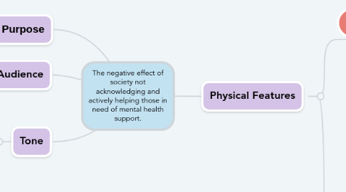
1. Purpose
1.1. To encourage the public to reach out and help those in need.
2. Audience
2.1. The general public
3. Tone
3.1. There is a sense of urgency and sympathy due to the man nature of the man in this ad and the suggestion on his wellbeing. However, there is also a contrasting optimistic and encouraging tone created by the catchphrases displayed to the left of the man.
4. Physical Features
4.1. Illustrations
4.1.1. Camera Angles
4.1.1.1. Wide angle
4.1.1.1.1. Allows the viewer to acknowledge what it looks like when someone is in need of their help.
4.1.1.2. Long-range shot
4.1.1.2.1. The man only takes up a small fraction of the poster, thus making him seem small. This is done to reflect the feeling of unimportance those struggling may feel due to the lack of help they receive.
4.1.2. Layout
4.1.2.1. Horizontal
4.1.2.1.1. The ad being landscape suggests that it is a billboard. Billboards are massive and can be seen my many people, therefore highlighting that this issue in important and needs to be acknowledged by the public.
4.1.3. The image
4.1.3.1. The weather in the picture is open to interpretation.
4.1.3.1.1. It is a pretty standard day and the sky is not sunny, nor dismal, However since the man in the image is sombre, we (as viewers) interpret the weather as more gloomy. This highlights how, depending on our interaction with people, our day can completely change. This sends the message that instead of making people feel alone by not interacting with them, you can make someone's day by reaching out to them.
4.1.3.2. In the picture, the left side is left with open space/ inanimate train tracks.
4.1.3.2.1. This is done to communicate the notion that the man is searching for a purpose or help but he is only left with abyss.
4.1.4. The man in the image
4.1.4.1. The man is isolated on a train station platform, staring out to the train tracks aimlessly.
4.1.4.1.1. This hints at notion that he is contemplating suicide, thus suggesting he has mental health issues and clearly needs help, however, he is unable to find any - only making his situation worse.
4.1.4.2. He is stood alone and does not have any text surrounding him.
4.1.4.2.1. This displays the sense of isolation he feels. He may feel lonely and all it takes for him to feel better is somebody reaching out.
4.1.4.3. His coat is cast off and he has a limp stance.
4.1.4.3.1. Suggests he is tired and lacks motivation in life (a symptom of depression). His symptoms could perhaps be eased if he received emotional support from others.
4.1.4.4. He has no belongings with him.
4.1.4.4.1. No backpack or briefcase notifies that he is not commuting to work, thus connoting he has no purpose or feels as if he has no purpose.
4.1.5. Text
4.1.5.1. Dark coloured text located on brightest part of the background.
4.1.5.1.1. Draws the viewer’s eye towards the text and makes it easy to read, thus enabling their message to efficiently spread.
4.1.5.2. The positive catchphrase "find out how a little talk can make a big difference", "save lives" and the samaritans logo are all coloured green.
4.1.5.2.1. Green is a colour with connotations or exuberance and correction, indicating that following through with the message in the ad will enrich lives and is the right thing to do.
4.1.5.3. Irregular tont
4.1.5.3.1. The irregular text symbolises how people's lives cannot be orchiratated to perfection and everyone will have ups and down. This allows the viewer to realise that they should check up on people and help others through tough times.
4.1.5.3.2. The informality of the font suggests that anyone can assist someone with mental health issue despite not being a professional.
4.1.5.3.3. The font also makes the ad less sterile, therefore, becoming more intimate and memorable to the veiwer.
4.1.5.4. The speech bubbles containing the catchphrase "small talk, save lives"are noticeably different in size.
4.1.5.4.1. This contrast in size is used to further support their point - that something minimalistically kindhearted can greatly benefit others. The large display of "save lives" also amplifies the importance of helping others. The contrasting colours are used for emphasis.
4.2. Language
4.2.1. Body Text
4.2.1.1. You
4.2.1.1.1. Directly addresses the reader, making the ad more intimate and empowering.
4.2.1.2. The last words are "save a live"
4.2.1.2.1. This intertwines with the image in the background and is quite a hefty phrase. It makes the viewer realise that they can be responsible for letting somebody suffer and possibly die or by simply intervening can assist them out of misery. The phrase "save lives" is repeated three times throughout the ad, therefore, placing emphasis on it. This makes the ad emotional to the viewer, thus further encouraging them to take action.
