
First entry , blank screen with company logo fading into user interface (1)
por Haroon Dabbagh
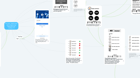
1. User interface for mass use customers. Similar style to above except with name of my company. More central withi logo near the top
1.1. Main purpose and framework is that it has to be easy and convenient for people to navigate through. No extra unnecessary parts.
2. Next page would be to check email or message to confirm the account
3. Use email and phone number only for important things such as forget passwords or to confirm their account
4. Secure passport with capitals , numbers and atleast 8 characters
5. This is the question area. Where all general questions will be asked and answered
6. Tips page
7. This next page will be a main menu for the business their buying from.
8. This page will be info page
9. This will be the next section for catalogue (lots page ) which is usually between 500-1500 items . This will be split into 100s for easy navigation . The checked section is a section where items have been checked and have a report
9.1. Next section will split each 100s into 5 divisions. This will allow customers to navigate. faster to their specific want . Each 20 will have its own sub category names . This will make even easier.
9.1.1. Next section will have each category individually with picture and decay of item . Pic above for example purposes . Red circle would mean not checked item . Green would mean checked . Yellow would mean pending
9.1.1.1. When having clicked on an item . It will have this . More bigger and detailed .
9.1.1.1.1. Each item can have upto 4 videos uploaded by business with maximum time of 15 seconds . It will have bullet pointed very summarised description.. allow upto 5 pictures . The picture above is example of checked item . If item hasn’t been checked . It will only have the generic picture and description
9.1.1.1.2. Customer can only ask for report of 5 items . If they want to do 10 . It’ll be £1.29. For upto 20 items £2.99. Per week