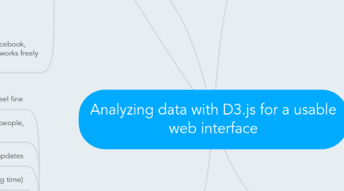
1. WHO
1.1. Who this data would be useful for: Companies and governments who wish to predict future development in certain areas of the world.
1.2. Another way of doing this project would be to give a fun and experimental idea to public by passing on some joy like the app: Listen to wikipedia: http://listen.hatnote.com/
2. WHERE
2.1. big data sets: http://hadoopilluminated.com/hadoop_illuminated/Public_Bigdata_Sets.html or http://www.kdnuggets.com/datasets/index.html
2.1.1. Idea was to use the data set from the Gardian (over 250m events in over 300 categories from riots and protests to diplomatic exchanges and peace appeals) and compare it with the world Human Development reports as well as OECD report on interest in computer science. From this we could find correlations and maybe predictions on what affects a nation to develop more and especially in terms of technology.
2.1.2. Gardian data: http://www.theguardian.com/news/datablog/2013/apr/12/gdelt-global-database-events-location
2.1.3. The Human Development Report data: http://www.google.com/publicdata/explore?ds=kthk374hkr6tr_
2.1.4. OECD: http://www.oecd-ilibrary.org/economics/oecd-factbook-2013_factbook-2013-en
2.2. There are also data from facebook, twitter and other social networks freely available.
3. EXAMPLES (from online)
3.1. we feel fine
3.1.1. http://www.wefeelfine.org/movements.html
3.2. Pleens: mobile app that links people, emotions, stories and places.
3.2.1. http://www.pleens.com/
3.3. Listen to wikipedia updates
3.3.1. http://listen.hatnote.com/
3.4. Here is troday (for understanding time)
3.4.1. http://hereistoday.com/
3.5. displaying of gun deaths
3.5.1. http://guns.periscopic.com/?year=2013
3.6. Global economic ralations
3.6.1. http://viz.ged-project.de/
3.7. Meteorites and other visualizations
3.7.1. http://www.kimalbrecht.com/project/meteorites/
3.8. urban world
3.8.1. http://www.mckinsey.com/insights/mgi/in_the_news/urban_world_app
3.9. Biliionaires compared
3.9.1. http://www.bloomberg.com/billionaires/2014-06-09/cya
3.10. exploring our universe
3.10.1. http://workshop.chromeexperiments.com/stars/
4. Book that could be helpful:
4.1. Interactive Data Visualization for the Web
4.2. http://chimera.labs.oreilly.com/books/1230000000345
4.3. advertisement video: https://www.youtube.com/watch?v=yECYJbTwlWk
5. WHAT (Scope of the project)
5.1. Technologies needed: Database (MySQL), Javascript for final visualization (D3.js), Backend data analysis with Apache Hadoop (maybe?), and finally a website providing the information in a way that's easy to understand (HTM5)
5.2. I know the scope of the project is quite large, but i'll try to maintain it to mostly understanding the known technologies and focusing on D3.js as a means of creating an easy to understand website interface for understanding the data. In other words my focus is on creating a usable interface with data visualization
5.3. Things to consider:
5.3.1. What makes a good visualization = quick comprehensibility
5.3.2. UI understanding when building website with data
5.3.3. possible ways of changing the appearance of the data to suite an individuals need?
5.3.4. teaching and future prediction planning
5.3.5. understanding data analysis with statistical methods.
5.3.6. understanding the technologies involved
5.4. Other possible tools:
5.4.1. polymaps: http://polymaps.org/
5.4.2. Flot: http://www.flotcharts.org/
5.4.3. Processingjs: http://processingjs.org/
5.4.4. tangle: http://worrydream.com/Tangle/
5.4.5. fontfont: https://twitter.com/FontFont/
5.4.6. google maps: https://developers.google.com/maps/
5.4.7. Miso: http://misoproject.com/
5.4.8. Sigma: http://sigmajs.org/

