

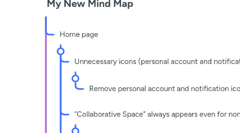
1. Home page
1.1. Unnecessary icons (personal account and notifications) at the top.
1.1.1. Remove personal account and notification icons from the top of the page.
1.2. “Collaborative Space” always appears even for non-registered users.
1.2.1. Hide “Collaborative Space” until you log in.
1.3. “Events” that are no longer necessary.
1.3.1. Remove “Events” from the menu.
1.4. Search box appears as an open field instead of an icon.
1.4.1. Replace the search box with an icon and place it under the Navigation Bar.
2. Login Page
3. Ideas Page
4. Notifications Page
5. Collaborative Sessions Page
5.1. The page is unorganized and contains scattered elements.
5.1.1. Display a session schedule with days and hours in an organized table.
5.2. There is no clear way to display sessions.
5.2.1. When clicking on a session, a detailed page will appear showing participants (lawyer, investor, and innovator).
5.2.2. Add controls like enabling/disabling the microphone, video, and recording the session.
6. Profile Page
6.1. A unified design for all users may not meet their needs.
6.1.1. Create a customized design for each user type
6.2. Displaying liked ideas in the profile is unnecessary.
6.2.1. Remove liked ideas from the profile and display them on the Ideas page with a filter.
6.3. No details about past sessions.
6.3.1. Add a section for past sessions containing session details, outcomes, and recordings.