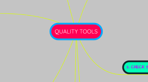
1. 3. CONTROL CHARTS
1.1. Graphs used to study how a process changes over time.
1.2. When controlling ongoing processes by finding and correcting problems as they occur.
1.3. When predicting the expected range of outcomes from a process.
1.4. When determining whether a process is stable (in statistical control).
1.5. hen analyzing patterns of process variation from special causes (non-routine events) or common causes (built into the process).
1.6. When determining whether your quality improvement project should aim to prevent specific problems or to make fundamental changes to the process.
2. 4. HISTOGRAM
2.1. The most commonly used graph for showing frequency distributions, or how often each different value in a set of data occurs.
2.2. When to Use a Histogram
2.2.1. When the data are numerical.
2.2.2. When analyzing whether a process can meet the customer’s requirements.
2.2.3. When analyzing whether a process can meet the customer’s requirements.
2.2.4. When analyzing what the output from a supplier’s process looks like.
2.2.5. When you wish to communicate the distribution of data quickly and easily to others.
3. 5. PARETO CHART
3.1. Shows on a bar graph which factors are more significant.
3.2. Also called: Pareto diagram, Pareto analysis
3.3. A Pareto chart is a bar graph. The lengths of the bars represent frequency or cost (time or money), and are arranged with longest bars on the left and the shortest to the right. In this way the chart visually depicts which situations are more significant.
3.4. When to Use a Pareto Chart
3.4.1. When analyzing data about the frequency of problems or causes in a process.
3.4.2. When communicating with others about your data.
3.4.3. When there are many problems or causes and you want to focus on the most significant.
3.4.4. When analyzing broad causes by looking at their specific components.
4. 7. STRATIFICATION
4.1. A technique that separates data gathered from a variety of sources so that patterns can be seen (some lists replace “stratification” with “flowchart” or “run chart”).
4.2. Stratification is a technique used in combination with other data analysis tools.
4.3. When data from a variety of sources or categories have been lumped together, the meaning of the data can be impossible to see
4.4. This technique separates the data so that patterns can be seen.
4.5. When to Use Stratification
4.5.1. When to Use Stratification
4.5.2. When data come from several sources or conditions, such as shifts, days of the week, suppliers or population groups.
4.5.3. When data analysis may require separating different sources or conditions.
5. 1. CAUSE AND EFFECT DIAGRAM
5.1. also called Ishikawa or fishbone chart
5.2. Identifies many possible causes for an effect or problem and sorts ideas into useful categories.
5.3. Brainstorm the major categories of causes of the problem. If this is difficult use generic headings:
5.3.1. Methods
5.3.2. Machines (equipment)
5.3.3. People (manpower)
5.3.4. Materials
5.3.5. Measurement
5.3.6. Environment
6. 2. CHECK SHEET
6.1. A structured, prepared form for collecting and analyzing data; a generic tool that can be adapted for a wide variety of purposes.
6.2. When data can be observed and collected repeatedly by the same person or at the same location.
6.3. When collecting data on the frequency or patterns of events, problems, defects, defect location, defect causes, etc.
6.4. When collecting data from a production process.
7. 6. SCATTER DIAGRAM
7.1. Graphs pairs of numerical data, one variable on each axis, to look for a relationship.
7.2. Also called: scatter plot, X–Y graph
7.3. The scatter diagram graphs pairs of numerical data, with one variable on each axis, to look for a relationship between them. If the variables are correlated, the points will fall along a line or curve. The better the correlation, the tighter the points will hug the line.
7.4. When to Use a Scatter Diagram
7.4.1. When you have paired numerical data.
7.4.2. When your dependent variable may have multiple values for each value of your independent variable.
