First entry , blank screen with company logo fading into user interface (2)

Get Started. It's Free
or sign up with your email address
First entry , blank screen with company logo fading into user interface (2) by Mind Map: First entry , blank screen with company logo fading into user interface  (2)

1. User interface for mass use customers. Similar style to above except with name of my company. More central withi logo near the top

1.1. Main purpose and framework is that it has to be easy and convenient for people to navigate through. No extra unnecessary parts.

2. Next page would be to check email or message to confirm the account

3. Use email and phone number only for important things such as forget passwords or to confirm their account

4. Secure passport with capitals , numbers and atleast 8 characters

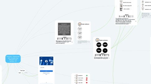
5. This page will be info page

6. When having clicked on an item . It will have this . More bigger and detailed .

6.1. Customer can only ask for report of 5 items . If they want to do 10 . It’ll be £1.29. For upto 20 items £2.99. Per week

7. Each item can have upto 4 videos uploaded by business with maximum time of 15 seconds . It will have bullet pointed very summarised description.. allow upto 5 pictures . The picture above is example of checked item . If item hasn’t been checked . It will only have the generic picture and description

7.1. It is very important that the report available for all users . Not just 1 customer . That whenever report is given , it updates on both operating systems. Android , iOS . Website as well

7.1.1. The bottom tabs of home saved and question mark will alwys be on every page

8. Next section will have each category individually with picture and decay of item . Pic above for example purposes . Red circle would mean not checked item . Green would mean checked . Yellow would mean pending

9. Tips page

10. This will be the next section for catalogue (lots page ) which is usually between 500-1500 items . This will be split into 100s for easy navigation . The checked section is a section where items have been checked and have a report

10.1. Next section will split each 100s into 5 divisions. This will allow customers to navigate. faster to their specific want . Each 20 will have its own sub category names . This will make even easier.

11. After logging in, this will be first page . It will be more designed , much better And appealing

11.1. This next page is the auctions tab. After clicking on that will be the list of auctions that will have signed up to this software

12. This next page will be a main menu for the business their buying from.

13. Mine will be more simplistic . The top part will be all gone . Just my logo . Everything else will be same .

14. New Topic

15. Login

15.1. New Topic

16. Now for the saved tab . This will entail all items I have saved whilst viewing the catalogue . It’s important for items to be viewed in away where’s it easy and fast . . This will be a mixture .

17. This is the question area. Where all general questions will be asked and answered