Unlock the full potential of your projects.
Try MeisterTask for free.
¿No tienes una cuenta?
Regístrate Gratis
Navegar
Mapas Destacados
Categorías
Negocios
Diseño
Educación
Entretenimento
Vida
Mercadotecnia
Productividad
Resúmenes
Tecnología
Otros
Idiomas
English
Deutsch
Français
Español
Português
Nederlands
Dansk
Русский
日本語
Italiano
简体中文
한국어
Otros
Ver mapa completo
Copiar y editar mapa
Copiar
Getting Information And Booking For A Cruise
Otros
PY
Pek Yu Kiat
Seguir
Comienza Ya.
Es Gratis
Regístrate con Google
ó
regístrate
con tu dirección de correo electrónico
Mapas Mentales Similares
Esbozo del Mapa Mental
Getting Information And Booking For A Cruise
por
Pek Yu Kiat
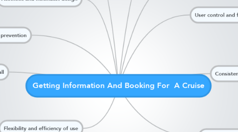
1. Error prevention
1.1. Clear layout and information
1.2. Easy to navigate interface
2. Recognition rather than recall
2.1. Clear border on each section.
2.2. Easy to navigate
3. Flexibility and efficiency of use
3.1. Anything related to cruise are led to 1 page
4. Aesthetic and minimalist design
4.1. All trips are with Singapore Cruise.
4.2. All response are with clear information
5. Help users recognize, diagnose, and recover from errors
5.1. Popped up windows does not show anything.
5.2. Does not have links to proceed further to booking of cruise.
6. Visibility of system status
6.1. When viewing cruises rates. Window pops up. User would not know whether the pdf file is being loaded .
6.2. Booking of vacations are located at the bottom of the page.
7. Match between system and the real world
7.1. Contact numbers are accompanied by a telephone symbol.
8. User control and freedom
8.1. All windows popped up are with a exit button at top right hand corner
9. Consistency and standards
9.1. When grey screen pop up. Arrow right just reloads page.
9.2. What does the term "Black-Out Dates" means?
9.3. Uses same 'rates' icon.
9.4. What does 2/3/4 means?
9.5. Seasons are not in every package.
10. Help and documentation
10.1. Too much information on the main page.
10.2. Do not have any information on how to book a cruise.
Comienza Ya. ¡Es Gratis!
Conéctate con Google
ó
Regístrate