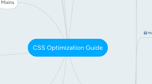
1. Keep it readable
1.1. keep your CSS very vanilla
1.1.1. Use LESS for only
1.1.1.1. imports
1.1.1.1.1. so that variables and mixins are available everywhere and it all outputs to a single file
1.1.1.2. data-uri
1.1.1.3. variables
1.1.1.4. some mixins
2. JavaScript
2.1. Separate style and behavior concerns by using .js- prefixed classes for behavior
2.2. The .js- class makes it clear to the next person changing this template that is being used for some JavaScript event and should be approached with caution
2.3. Use a descriptive class name
2.3.1. i.e.
2.3.1.1. .js-open-context-menu is more clear than .js-menu
2.3.1.2. the class should always include a verb since it's tied to an action
2.4. .js- classes should never appear in your stylesheets. They are for JavaScript only.
2.5. You will see state classes like .is-state in your JavaScript and your stylesheets as .component.is-state
3. Mixins
3.1. prefix mixins with .m- and only use them sparingly for shared styles
3.2. Mixins are share styles that are used in more than one compoanent
3.3. use sparingly
3.4. it should include the parenthesis to make ti more obvious that it's a mixin
4. Utilities
4.1. prefix utility classes with .u-
4.2. all utils should be in a single file
5. File Structure
5.1. include normalize.css at the top of the file
5.2. Include variables, mixins and utils (respectively)
5.3. Then include the components
5.3.1. Each component should have its own file and include all the necessary modifiers, states, and media queries
5.4. This should output a single app.css file
6. Style
6.1. Alphabetize declarations
6.2. No underscores or camelCase for selectors
6.3. Use shorthand when appropriate
6.4. Prefer hsl(a) over hex and rgb(a)
6.4.1. working with colors is easier with hsl, especially when making things lighter or darker, since you only have one variable to adjust
6.5. Use 2 spaces to indent, not 4 spaces and not tabs
6.6. In your markup, order classes like so <div class="component mod util state js"></div>
6.7. avoid body classes. There is rarely a need for them. Stick to modifiers within your component
7. Less CSS Pre-Processor
8. Naming
8.1. Based on what they are, not what they look like
9. Components
9.1. Use the .component-descendant-descendant pattern
9.2. help encapsulate your CSS and prevent run-away cascading styles and keep things readable and maintainable
9.3. create hyphen-separated class for the descendant element like .header.image {...}
9.4. make sure every selector is a class
9.5. indent descendant classes so their relationship is even more obvious and it's easier to scan the file
9.6. Stateful things like :hover should be on the same level
9.7. Modifiers
9.7.1. use the .component-descendant.mod-modifier pattern
9.7.2. put it after the part of the component it mofidies
9.7.3. put modifiers on the same indention level as the selector it's modifying
9.7.4. Put modifiers at the bottom of the component file, after the original components
9.7.5. You'll often want to override a descendant of the modifier selector. Do that like so: .global-header-nav-item.mod-sign-up { background: hsl(120, 70%, 40%); color: #fff; .global-header-nav-item-text { font-weight: bold; } }
9.8. State
9.8.1. Use the .component-descendant.is-state pattern
9.8.2. Manipulate .is- classes in JavaScript (but not presentation classes)
9.8.3. Do not indent state classes
9.8.4. Should appear at the bottom of the file, after the original components and modifiers
9.9. Media Queries
9.9.1. Use media query variables in your component
9.9.1.1. each component should have its own file i.e. component.less
9.9.2. Include them inside your components
9.9.3. media-queries.less file
9.9.3.1. @highdensity: ~"only screen and (-webkit-min-device-pixel-ratio: 1.5)", ~"only screen and (min--moz-device-pixel-ratio: 1.5)", ~"only screen and (-o-min-device-pixel-ratio: 3/2)", ~"only screen and (min-device-pixel-ratio: 1.5)"; @small: ~"only screen and (max-width: 750px)"; @medium: ~"only screen and (min-width: 751px) and (max-width: 900px)"; @large: ~"only screen and (min-width: 901px) and (max-width: 1280px)"; @extra-large: ~"only screen and (min-width: 1281px)"; @print: ~"print";
9.9.4. Put media rules at the bottom of the component file
9.10. Keep it Encapsulated
9.10.1. Components shouldn't know anything about each other
9.10.2. If the smaller button can be reused in multiple places, add a modifier in the button component (like, .button.mod-small)
9.10.3. You should en up with a lot of components
9.10.3.1. Always be asking yourself if everything inside a component is absolutely related and can't be broken down into more components
9.10.3.2. If you start to have a lot of modifiers and descendants, it might be time to break it up
