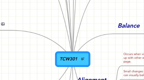
1. Rhetorical Knowlege
1.1. Identify, Articulate and focus on a defined purpose
1.1.1. Decide who your audience is.
1.2. Respond to the need of the appropriate audience
1.2.1. Know your audience. "what's in it for the reader"
1.3. Respond appropriately to the different rhetorical situations
1.4. Use conventions of format and the structure appropriate for the rhetorical situation
2. Critical Thinking, Reading & Writing
2.1. Use information, writing and reading for inquiry, learning, thinking and communicating.
2.2. Integrate previously held beliefs, assumptions and knowledge with new information and the ideas of others to accomplish a specific purpose within a context.
3. Knowledge of Conventions
3.1. Learn common formats for different genres
3.2. Develop knowledge of genre conventions ranging from structure to paragraphing to tone and mechanics
3.3. Understand and apply legal and ethical uses of information and technology including copyright and intellectual property
4. Processes
4.1. Be aware that it usually takes multiple drafts to create a complete and successful text
4.1.1. Several steps involved to completed copy. From outline to editing as well as design thumbnails and a comprehensive.
4.2. Develop flexible strategies for generating, revising, editing and proof-reading
4.3. Understand the collaborative and social aspects of research and writing processes
4.4. Use appropriate technologies to manage data and information collected or generated for future use
5. COURSE GOALS
5.1. 1. To take the the first step towards finishing my degree (this is the first class in that endeavor)
5.2. 2. To better understand the design concepts as they relate to print media, webdesign and promotional signage.
5.3. 3. Learn new technology, such as Midmeister, WordPress and Animoto. Use them to connect with others and share ideas.
6. Repetition
6.1. Repetition makes it possible to have elements that are unrelated, relate by repeating them.
6.2. Gestalt-explains why a strongly unified design seems greater than its individual parts
6.3. Figures are called positive elements. Grounds are called negative elements.
7. Fair Use, Copyright, Creative Commons
7.1. The laws of this country protect the author, musician, artist and any other creative work from being used without permission from the creator. That is Copyright.
7.2. There is also a designation for a creative work that allows the creator to signify that he or she wants the availability of their work to be used. The can set limitations. Creative Commons.
8. Basic text Alignments
8.1. Flush Left, Flush Right, Centered and Justified
9. Personal Notes
9.1. All text in black is from the example published by Professor Rodrigo. I put them in a chronological order. Although you can pull from any of the main subjects at any time, I feel there is the basic order from inception to completion.
10. Emphasis
10.1. Distinct difference between emphasis and contrast. Although they are sometimes referred to as being similar they are different
10.2. With emphasis come VISUAL HIERARCHY. This is the order of importance, visually, of the information in a design.
10.3. "Simple" designs in most cases are better.
10.3.1. This bit will come in handy when I am designing various ads and flyers for my store. We tend to have so much to say that the info gets lost on the page. I just had to design a banner for my bike department and I used the ideas of Emphasis in the design. I am already looking at things through better educated eyes.
11. Contrast
11.1. One of the best ways to engage a reader. They are more apt to enjoy reading something that is visually stimulating and creative than something bland and boring.
11.1.1. Probably will have a better chance that a reader will remember the information. I find it easier to remember a artistic representation than words on a page
11.2. Several Elements help define Contrast. They include, but are not limited to Text, Colors, Textures placement, size.
12. Balance
12.1. Visual weight has a large effect on the balance of a design. Each visual element has its own visual weight that must be carefully balanced and counterbalanced by other visual elements.
12.2. Choose which words, phrases and graphics should be emphasized and grouped together.
12.3. Symmetrical layouts are safe, asymmetrical layouts are dynamic
13. Alignment
13.1. Occurs when visual elements line up with other elements on the page.
13.2. Small changes in Alignment can visually balance a design
13.3. Using a grid structure with a consistent alignment scheme will unify a design.
13.3.1. Grids work great for multiple-page designs
13.4. Advanced Text Alignments
13.4.1. Runaround, Asymmetrical and Concrete
