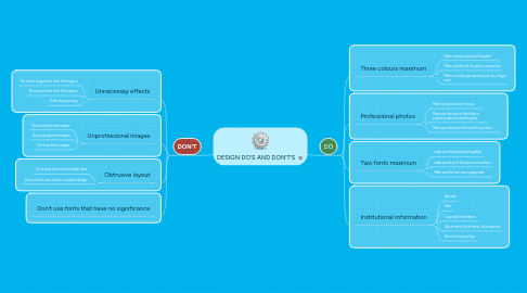
1. DON'T
1.1. Unnecessay effects
1.1.1. No text or images that don't fit the genre
1.1.2. No overlays that don't fit the genre
1.1.3. Think about synergy
1.2. Unprofessional images
1.2.1. Don't use stretched images
1.2.2. Don't use distorted images
1.2.3. Don't use blurry images
1.3. Obtrusive layout
1.3.1. Don't place text over the artist's face
1.3.2. Don't use too many photos or graphic design
1.4. Don't use fonts that have no significance
2. DO
2.1. Three colours maximum
2.1.1. Make sure they work well together
2.1.1.1. Materials
2.1.1.2. Personel
2.1.1.3. Services
2.1.1.4. Duration
2.1.2. Make sure they fit the genre conventions
2.1.3. Make sure they appropriately suit any images used
2.2. Professional photos
2.2.1. Make sure photos are in focus
2.2.1.1. Dependencies
2.2.1.2. Milestones
2.2.2. Make sure the size of the photo is proportionate to everything else
2.2.2.1. Schedule
2.2.2.2. Budget
2.2.3. Make sure the photo links with the product
2.2.3.1. KPI's
2.3. Two fonts maximum
2.3.1. make sure they work well together
2.3.2. make sure they fit the genre conventions
2.3.3. Make sure the font size is apprpriate
2.3.3.1. Included
2.3.3.2. Included
2.3.3.3. Excluded
2.4. Institutional information
2.4.1. Barcode
2.4.2. Date
2.4.3. Copyright information
2.4.4. Album name, Artist name, Artist website
2.4.5. Record company logo
