
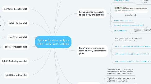
1. iplot() for a scatter plot
1.1. df.iplot(kind='scatter',x='A',y='B',mode='markers',size=10)
2. iplot() for bar plot
2.1. df2.iplot(kind='bar',x='Category',y='Values')
2.2. More often than not, you'll need to call some aggregate function on the DataFrame before invoking iplot() for a bar plot in order to get a useful visualisation
2.2.1. df.sum().iplot(kind='bar')
3. iplot() for box plot
3.1. df.iplot(kind='box')
4. iplot() for surface plot
4.1. This produces a 3 dimensional interactive plot and requires the input of 3 DataFrame numeric columns
4.1.1. df3.iplot(kind='surface',colorscale='rdylbu')
5. iplot() for histogram plot
5.1. df['A'].iplot(kind='hist',bins=25)
5.2. We can also call iplot() on the whole DataFrame with multiple numeric columns, in which case we get overlapping histograms that can be turned on/off interactively
6. iplot() for bubble plot
6.1. df.iplot(kind='bubble',x='A',y='B',size='C')
7. Why Plotly and Cufflinks?
7.1. Plotly is an open source library that provides interactive data visualisations and Cufflinks is a library that connects Plotly to the Pandas library
7.2. Plotly is also a company that makes its money from hosting interactive data visualisations in the cloud
7.2.1. We can use the open source library in offline mode for free
8. Installing Plotly and Cufflinks
8.1. According to the instructor of the Udemy course, neither Plotly nor Cufflinks are available via conda install; however, it appears this is only true for Cufflinks as of the time of writing (Oct-2021)
8.2. pip install plotly
8.2.1. Note: I ran the pip install via the Anaconda Powershell Prompt, which ensures it's installed into the anaconda3 virtual environment
8.3. pip install cufflinks
9. Set up Jupyter notebook to use plotly and cufflinks
9.1. import pandas as pd import numpy as np %matplotlib inline
9.1.1. Note: %matplotlib inline is a magic command that causes all plots based on matplotlib (including plotly, seaboran, etc.) to render automatically within the notebook
9.1.1.1. The alternative to using %matplotlib inline is to run the first statement at top of notebook and include the second statement at the end of every cell that includes a plot
9.1.1.1.1. from matplotlib import pyplot as plt
9.1.1.1.2. plt.show()
9.2. (screenshot)
9.2.1. Note: I can't write the version reference as text in Mindmeister because it interprets the leading double underscores as markdown for bold like this: __version__
9.2.1.1. Any new install of plotly should be sufficient for your needs; the main line of code to set up the notebook for using plotly is:
9.2.1.1.1. from plotly.offline import download_plotlyjs, init_notebook_mode, plot, iplot
9.3. import cufflinks as cf
9.4. init_notebook_mode(connected=True)
9.4.1. Needed for notebooks only
9.5. cf.go_offline()
9.5.1. Enables us to use plotly (via cufflinks) offline
10. DataFrame setup to demo some of Plotly's interactive plots
10.1. References to these two DataFrames are used throughout this mindmap
10.2. df = pd.DataFrame(np.random.randn(100,4),columns='A B C D'.split())
10.2.1. Produces a DataFrame with a hundred rows, arranged in 4 columns labelled A to D, each holding random numbers
10.3. df2 = pd.DataFrame({'Category':['A','B','C'],'Values':[32,43,50]})
10.3.1. Produces a DataFrame with a single row of numbers, split by 3 columns A, B and C
10.4. df3 = pd.DataFrame({'x':[1,2,3,4,5],'y':[10,20,30,20,10],'z':[5,4,3,2,1]})
10.4.1. Produces a DataFrame with 5 rows of numbers divided into 3 columns (x, y and z)
11. iplot() for a line plot
11.1. Thanks to cufflinks, we can invoke iplot() as a method on a DataFrame, which will invoke one of Plotly's interactive plots
11.2. The iplot() method without any arguments will produce a line plot of all the DataFrame's numeric columns
11.3. For comparison, we can invoke the plot() method first, which will produce a static line plot using the Matplotlib library
11.3.1. Run these two one after the other and compare
11.3.1.1. df.plot()
11.3.1.2. df.iplot()
11.3.1.2.1. Note the interactive features as you move the mouse across the plot, including dynamic highlighting of data point values, zoom in/out, panning, toggling on/off lines via the legend, downloading to png, etc.
12. iplot() for spread plot
12.1. Spread plots are popular for comparing stock prices
12.2. df[['A','B']].iplot(kind='spread')
12.2.1. The plot is a line plot above and a spread plot below, where the spread plot shows how diverged the two values become at each point of the x-axis
12.2.2. Note: when I ran this on its own I got a warning about the pandas.np module being deprecated
12.2.2.1. This warning was eliminated by running the following first:
12.2.2.1.1. import numpy as np