Get Started. It's Free
or sign up with your email address
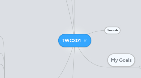
TWC301 by Mind Map: TWC301

1. Rethorical Knowledge

1.1. Need to know four things before starting a project: purpose, audience, format and design principles (C1)

1.2. Identify what is the most important element to be emphasized (C2)

1.2.1. New node

1.3. Identify the purpose of your ad and use contrasting colors, sizes, shapes, and fonts, for example, to appeal to your target audience(C3)

1.4. Format and structure will lead to balance, visually. (C4)

1.5. Alignment helps you respond to your audience appropriately by using the style that is needed. For example center aligned is more formal and depending on your audience you might choose this (C5)

1.6. The purpose of repetition in a layout is for the reader to follow the copy visually the way you want them to. (C6).

1.7. Formatting correctly creates visual flow and verbal flow. Allowing the creator to somewhat control how the reader looks at the information.(C7).

2. Critical Thinking, Reading, and Writing

2.1. Make list of what is in it for the customer. List these feature and benefits of your message (C1)

2.2. Choose words or phrases carefully so they have impact without wordiness (C2)

2.3. Know who your audience is and test it on the people you wrote it for D#2 HW#9

2.3.1. New node

2.4. Write some text large and some small, this contrast will be more interesting to the eye.(C3)

2.5. Balance makes it more likely that a person will read what you write. (C4).

2.6. Communicating your message is an important part of learning the skill of alignment. If your reader gets lost in the test (because you haven't done a good job of alignment) you have not communicated effectively(C5).

2.7. Communicating what is the most important in a layout can be accomplishes by combining typography and repetition (C6).

2.8. A writer can accomplish a specific purpose i.e. getting the reader to follow the flow as intended, by understanding how to arrange words and images on a page (C7).

2.9. Fair Use is determined by 4 factors 1. The purpose and character of the use. 2. The type of work invovled. 3. The amount and importance of the material used. 4. The effect of the use upon the market for the copyrighted laws. D#7

3. Processes

3.1. Write goals and brainstorm ideas. Organize thoughts into outline. Flesh out and outline with headings-write as if you are speaking and KISS. Thumbnail sketching, roughs and comps (C1)

3.2. Decide primary message and which elements communicate that, then decide secondary and tertiary and what communicates those. That will tell you what to emphasize (C2)

3.3. Create a prototype and conduct usability testing D#@ HW#9

3.4. Study examples of contrast in ads that are appealing to the eye. Learn about different design and typography techniques to use to make contrast work(C3)

3.5. Plan main areas differing visual weights so the ad is balanced. Vary lights and darks and sizes to make this more interesting. (C4).

3.6. Be prepared to use grids and do mutiple drafts and move text around until your work is aligned on a page isimilar to examples in the book.

3.7. After creating a layout standback and look at it several times to see if there is adequate repetition, but not too much as to confuse the reader. (C6).

3.8. Creating succesful visual flow requires knowledge of how readers eyes flow over a page, usually in a backward s shape for Westerners. A strategy for directing visual speed invovles images that point in a direction, either to speed up (to the right) or slow down (to the left).(C7).

3.9. Use diigo or other data saving technology to save creative commons citations for work that you use from their collections. D#7

4. Knowledge of Conventions

4.1. Use editors to verify copyright property. Know your customer and what style will appeal to them. Design principles to make effective layouts (C1)

4.2. New node

4.3. Write each step as a command and each bullet as an option D#2 HW#9

4.4. Contrasting colors and font size will give will appeal to different genres depending on which colors are used and font (C3)

4.5. The structure of an ad should be balanced at a glance. There are varied types of balance: symmetry, asymmetry, colors, lines and alignment. (C4).

4.6. Using grids will help you with formatting especially when doing multiple pages. Start with grids and the work will look better and go faster (C5).

4.7. Try different forms of repettion including figure/background, proximity, closure, continuation and similarity to achieve an effective message (C6).

4.8. Consistent use of visual elements creates a structure that can be used to make different pages look unified (C7).

4.9. Copyright infringement can occur even if someone does not copy a work exactly. Copyright infringement is when the work is substantially similar to the copyrighted work D#7

5. Outcomes:

6. My Goals

6.1. To understand the roles of new technology

6.2. Learn appropriate levels of formality for each genre

6.3. Improve writing skills

7. New node