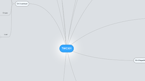
1. Ch 3 contrast
1.1. Color
1.1.1. Different colors draw users attention in different ways. Color can be used to easily distinguish between equal levels of information as well as organize structures in color coding to contrast what is most important and what is sub dominant and subordinate more in a way to connect these three between different types between other equal levels and even connections to larger or smaller relevant data.
1.2. size
1.2.1. One of the most obvious ways of ordering information. Larger font instantly communicates importance. This is most often used in headlines because of its ability to coordinate levels of importance. Strong sense of Dominance, Sub-dominance, and Sub-ordinance.
1.3. Shape
1.3.1. I think shape should be included in contrast because it could separate relevant information in how your eyes are draw from one shape to another. Say for instance a square block of information as opposed to an organic flowing form that leads your eyes to the next piece of information, as well as connecting interrelated info in meaningful ways to "guide your eyes".
1.4. Font
1.4.1. Font can order words and distinguish between information parts that either connect with each other or are intended to be headlines that are easily distinguished from their body content. Font can also change how words are read and how fast it takes to read them. This allows different fonts to emphasize key elements in body content that can be manipulated to serve different purposes.
2. CH 1 outcomes
2.1. Create better web sites
2.1.1. use skills learned to create a portfolio website
2.1.2. improve critical analysis for user interface design
2.2. Follow processes to accomplish goals
2.2.1. learn how to create my own A to Z process to determine how sites and sub pages should be structured
3. Ch 2 Emphasis
3.1. Informational hierarchies
3.1.1. how to create distinctions in information for guides
3.1.2. Keeping consistent when organizing different levels of importance
3.1.3. structure creation to use for developing a grid
4. Ch 4 balance
4.1. In this chapter, I gained a better understanding of the importance balance has in a design layout. When first deciding on what sort of layout to use, either symmetrical or asymmetrical, it is important to take into consideration what sort of message you are trying to communicate to your audience, and which sort of layout will best communicate that message. Symmetrical layouts seem to look more formal and sort of ordinary compared with asymmetrical, which to me, always appear to be more exciting in how they layout attracts my eye and guides it over the page.
5. New node
6. Ch 5 Alignment
6.1. Grid Systems
6.1.1. This chapter helped me to understand how grid systems will help me focus on what information the viewer needs to know, and what column grid will work best
6.1.2. incorporating consistent layouts for equal level information
6.1.3. I gained an understanding of when to break the grid so as to sort of highlight the info that I want to stick out in the viewers mind
