Unlock the full potential of your projects.
Try MeisterTask for free.
¿No tienes una cuenta?
Regístrate Gratis
Navegar
Mapas Destacados
Categorías
Negocios
Diseño
Educación
Entretenimento
Vida
Mercadotecnia
Productividad
Resúmenes
Tecnología
Otros
Idiomas
English
Deutsch
Français
Español
Português
Nederlands
Dansk
Русский
日本語
Italiano
简体中文
한국어
Otros
Ver mapa completo
Copiar y editar mapa
Copiar
10 Usability Heuristics for www.hardwarezone.com.sg
NJ
Ng jing kiat
Seguir
Comienza Ya.
Es Gratis
Regístrate con Google
ó
regístrate
con tu dirección de correo electrónico
Mapas Mentales Similares
Esbozo del Mapa Mental
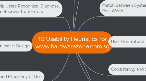
10 Usability Heuristics for www.hardwarezone.com.sg
por
Ng jing kiat
1. Recognition rather than Recall
1.1. Every categories and filters has drop down lists
1.2. In search results, there is no Suggestions to help users
2. Flexibility and Efficiency of Use
2.1. On top right of the page, there are headers linking to different categories of news
2.2. There is no shortcut from one article to another
3. Aesthetic and Minimalist Design
3.1. The Facebook social plugin in every page which distracts users
3.2. The site has a consistent black and green theme
4. Help Users Recognize, Diagnose, and Recover from Errors
4.1. Uses a default error page if internet connection is cut off
4.2. Search results does not have related links of the item being searched
5. Help and Documentation
5.1. There is no meaning or help on terms like CPU and NAS
6. Visibility of system status
6.1. Tells users which page the user is using a black square on the page number
6.2. When going from article to article, there is no indication whether the page is loading or not
7. Match between System and the Real World
7.1. Under News Categories, it uses terms like CPU for computer builders
7.2. For promotions, the header is named "Buys of the Week" which may mislead users
8. User Control and Freedom
8.1. In articles, there is “Go back” button to return users to the previous page
8.2. If users pick a specific category, the header would have the category's name like "All CPU News"
9. Consistency and Standards
9.1. The Categories box are on every article
9.2. Every promotion has a picture and caption
10. Error prevention
10.1. In promotions page, all pictures will link to the article
10.2. Every category the user picks has a header
Comienza Ya. ¡Es Gratis!
Conéctate con Google
ó
Regístrate