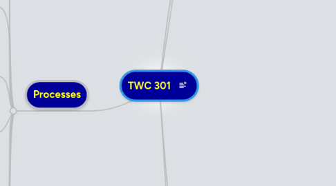
TWC 301
作者:kelly Corbett


1. Critical Thinking, Reading, and Writing
1.1. Use information, writing, and reading for inquiry, learning, thinking, and communicating
1.2. Integrate previously held beliefs, assumptions, and knowledge with new information and the ideas of others to accomplish a specific purpose within a context
1.3. What kind of page designs did other people create when presented with a similar problem? Looking at other's layouts can help you identify what works and what to avoid in your work. Chp. 1
1.4. Understand that there are some pieces of information, which, if unemphasized or unclear could undermine the usefulness of your message. Chp. 2
1.5. Keep your instructions short and concise. Don't say something in 30 words that you could say in 7, and limit each instruction to one main idea. (Instructions)
1.6. The combination of the principles of contrast + flow + alignment = a clean, organized, page. Chp. 3
1.7. A balanced design is one in which the visual weights of all of the elements are equally dispersed throughout the layout. Visual weight is the illusion of physical weight of a visual element on the page. Chp. 4
1.8. Text can be aligned in the following ways: flush left, flush right, centered, justified, runaround, asymmetric, and concrete. Chp. 5
1.9. Unity is achieved when all of the separate elements on a page look as if they belong together. Chp. 6
1.10. Verbal flow is the order in which the viewer reads the text on the page. Visual flow is the order in which the viewer looks at the images and graphics on the page. Chp. 7
1.11. The public domain is properly seen as a rich cultural legacy and reservoir of shared value. It is a vital foundation for civic life, education and culture. We actively need to protect it. Copy
2. Processes
2.1. Be aware that it usually takes multiple drafts to create and complete successful text
2.1.1. New node
2.2. Develop flexible strategies for generating, revising, editing, and proof-reading
2.2.1. New node
2.3. Understand the collaborative and social aspects of research and writing processes
2.4. Use appropriate technologies to manage data and information collected or generated for future use
2.5. Thumbnail sketches are small, quick, exploratory sketches. They are teh visual proof of the thinking and analyzing process. Once you have the thumbnails you can pick and choose from them. Chp. 1
2.6. Ask yourself What is your primary message? Which element best communicates this primary message? Is there a secondary message?Which visual element is the most interesting? Chp. 2
2.7. Know your audience. Have an idea of your submitter's demographic and background, so you will include language they will understand (Instructions)
2.8. Contrast is about making the page visually appealing so the reader wants to spend time looking at it. Chp. 3
2.9. Using a symmetrically balanced layout works just fine when you are trying to convey a sense of dignity, history, or formality. On the other hand, if you want a more dynamic design, then you might want to try an asymmetrical layout. Chp. 4
2.10. A grid is a nonprinted system of horizontal and vertical lines that divides the page and helps the page designer align element consistently. Chp 5
2.11. The principle of repetition draws on the ability of the human mind to see patterns and draw conclusions from those patterns. When we see things that are exactly the same or similar, we naturally group them. Chp. 6
2.12. In general, good verbal flow is achieved primarily through consistency in typographic treatment and establishing a logical reading path through a document. Chp. 7
2.13. Copyright protection should last only as long as necessary to achieve a reasonable compromise between protecting and rewarding the author for his intellectual labour and safeguarding the public interest in the dissemination of culture and knowledge. Copy
3. My Course Goals
3.1. Make it a habit of completing multiple drafts before the final text is created
3.2. Improve thesis writing skills
3.3. Become more comfortable with others viewing & proofing my work, understand it is constructive critcism
3.4. Improve time management when it comes to writing
3.5. Work on flow. Flow demands purposeful arrangement of visual elements in the page layout to control the way the viewer's eye scans through the design. Chp. 1
3.6. Understand how to design a simple yet effective logo/poster, etc. using the idea of visual hierarchy and emphasis. Learn how to use text and images correctly in order to do this. Chp. 2
3.7. Have contextual instructions. Make sure that your instructions are in a place nearest to the appropriate activity, and at the appropriate time in the collection process. (Instructions)
3.8. Drawing on the principle of repetition, use diamond shapes as bullets to lead the viewer's eye down the page. Chp. 3
3.9. Skewing visual elements diagonally away from the horizontal and the vertical adds a sense of energy and movement to a page. Chp. 4
3.10. Setting up a clear alignment scheme in the form of a grid is beneficial for newsletters, magazines, or books and other multiple-page publications. Chp. 5
3.11. To help unify my designs I can use the gestalt principles of figure/ground, proximity, closure, continuation, and similarity. Chp. 6
3.12. My typographic master plan should include such details as the typefaces, sizes, and colors you will use for the headlines, subheads, body copy, picture captions, or pull quotes. Chp. 7
3.13. Fair use is the right to use copyrighted material without permission or payment under some circumstances- especially when the cultural or social benefits of the use are predominant. It is a general right that applies even in situations where the law provides no specific authorization for the use in question. Copy
4. Rhetorical Knowledge
4.1. Identify, articulate, and focus on a defined purpose
4.2. Adopt appropriate voice, tone, and level of formality
4.3. Understand the role of a variety of technologies/media in accessing, retrieving, managing, and communicating information
4.4. Respond appropriately to different rhetorical situations
4.5. Ask yourself who your audience is and how they would best learn. Bullets help readers identify important information quickly. Chp. 1
4.6. Almost all pages benefit from the use of emphasis to help structure the visual space and to clarify presentation of the information. You must decide which words or phrases or graphics are the most important. Chp. 2
4.7. Use the imperative mood. Make your instructions specific commands instead of vague statements. (Instructions)
4.8. Using the principle of emphasis helps you intellectually organize your information and begin to visually differentiate it, whereas using the principle of contrast really stresses the visual difference between visual elements. Chp. 3
4.9. The overall success of a page layout depends on the relationship between the format's size and shape and the visual elements on the page. Chp. 4
4.10. Establishing a strong grid and then breaking it catches the viewer's eyes and adds extra emphasis to a page layout. Elements that break the grid at an angle are especially effective. Chp. 5
4.11. One of the primary purposes of the principle of repetition is to tie together the otherwise separate visual components of the design. Repeating visual elements such as lines, slopes, images, textures, and so on forms a visual rhythm that strengthens the overall organization of a design. Chp. 6
4.12. The rule lines form a repetitive element defining the boundaries of the text, and combined with the graceful tapering stroke of the background image lead the viewer's eye down the page. Chp. 7
4.13. Law provides copyright protection to "works of authorship" in order to foster the creation of culture. Its best-known feature is protection of owners' rights. But copying, quoting, and generally re-using existing cultural material can be, under some circumstances, a critically important part of generating new culture. Copy
5. Knowledge of Conventions
5.1. Develop knowledge of genre conventions ranging from structure and paragraphing to tone and mechanics
5.1.1. New node
