Magazine Advert Final Copy Feedback
by Jordan Spurge

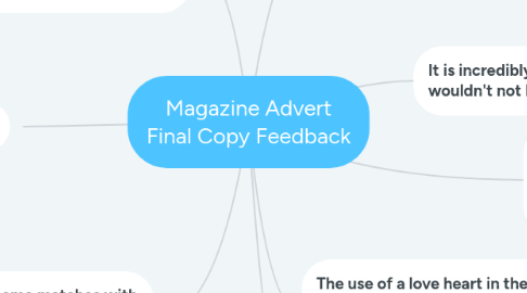
1. The contrast between the text and the image in the background is well produced.
2. The Colour theme matches with the text, it is easily readable and satisfying to look at.
3. The use of triangles is unique.
4. It is incredibly eye catching- I wouldn't not look at it.
5. The font is a perfect size to read, it is not difficult to see if i was walking past the advert which is important for me as a viewer.
6. Additionally, the photo in the middle of the star image compliments the overall theme.
7. The colour theme is vibrant and stands out.
8. The use of a love heart in the background image conforms to the codes and conventions of the pop genre.


