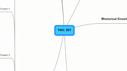
1. Critical Thinking, Reading, and Writing
1.1. Use information, writing, and reading, for inquiry, learning, thinking, and communicating.
1.2. Integrate previously held beliefs, assumptions, and knowledge with new information and the ideas of others to accomplish a specific purpose within a context.
2. Processes
2.1. Create multiple drafts to create and complete a successful text.
2.2. Develop flexible strategies for generating, revising, editing. and proof-reading.
2.3. Understand the collaborative and social aspects of reasearch and writing processes.
2.4. Use appropriate technologies to manage data and information collected or generated for future use.
3. Personal Goals
3.1. Use a wide range of technologies to present information.
3.2. Improve critical thinking and process information creatively.
3.3. Develop flexible and doable strategies for projects.
3.4. Improve design process
4. BoD
4.1. Chapter1
4.1.1. Design Process: Thumbnail skectches, very important step usually skipped by beginners.
4.1.2. Planning: This helps overcome the intimidation of blank thoughts.
4.1.3. Know your message, audience and format to be used.
4.1.4. Six Design Principles:Emphasis, Contrast, Balance, Alignment, Repetition, Flow.
4.2. Chapter 2
4.2.1. Emphasis in design keeps the audience engaged.
4.2.2. Emphasis stated that the most important element on a page should be the most prominent.
4.2.3. By emphasizing, the reader is able to pick out the most important info, for example in data reports.
4.2.4. When there is more than one important piece in a work, then hierarchy plays an important role in order to distinguish.
4.3. Chapter 3
4.3.1. Designs become more interesting when we add a contrasting element.
4.3.2. Contrast visually stresses the difference between elements, for example, the use of two different scrip and size font.
4.3.3. It is a good ides to use size contrast, color contrast, typeface contrast, weight contrast and texture.
4.3.4. Do not be afraid of being bold!!
4.4. Chapter 4
4.4.1. In order to achieve balance, there must be visual elements arranged thoughtfully.
4.4.2. There can be symmetrical and asymmetrical balance.
4.4.3. Before attempting to balance a work, you need to know what material is more important and therefore needs to be emphasized.
4.4.4. Readers will take more serious your material when it is thoughtfully balanced out.
4.4.5. The more principles used, the more thoughtful, communicative, and functional the final design.
4.5. Chapter 5
4.5.1. Figure 5-3 give an important tip that I would have passed. It mentions alignment with graphics of a graphics. For example, aligning text with the white rectangles if the trash can.
4.5.2. Alignment helps make a design look organized.
4.5.3. Use the grid to keep the pattern repeated through a page layout and maintain it constant in measure.
4.5.4. Aligning text has different feels and readability levels. For example, left alignment is easier to read and right center alignment give a more formal feel.
4.5.5. Lack of alignment ends in a cluttered space, the contrary reinforces a professional appearance.
4.6. Chapter 6
4.6.1. Repetition helps a page look stronger, interesting and more sophisticated.
4.6.2. Through repetition you can achieve unity. This makes the project look like all separate elements belong together.
4.6.3. Through typography you can unite multiple pages and make it appear like one complete work.
