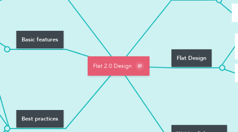
Flat 2.0 Design
by Beatriz Rojo

1. Opposites
1.1. 3D-Design (Windows 95)
1.2. Skeuomorphism: Metaphors (Bookshelf)
1.3. Realism: Visual style (wood textures)
2. Flat Design
2.1. Sacrifices usability to suit a specific design aesthetic
2.2. No signifiers of clickability
3. Bad practices
3.1. Icons with long shadows: the don´t add any meaningful information to the users
3.2. Ghost buttons: Texts within a thin rectangular rectangle
4. Basic features
4.1. Subtle shadows , highlights and layers to create some depth
5. Best practices
5.1. Rectangular buttons, preferably with rounded corners
5.2. Make all elements associated with each other (text, icons) clickable
5.3. When using icons for links, combine it with a text label
5.4. Avoid inconsistency
6. Writing link texts
6.1. Length is less important than a good link description
6.2. Avoid general texts such as "Click here", "Read more"
6.3. Color them consistenly


