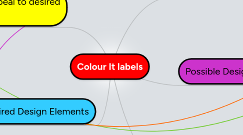
Colour It labels
by Laura Imbruglia


1. What would appeal to desired demographic?
1.1. Fitting style
1.1.1. Youthful
1.1.2. Arty
1.1.3. Current
1.1.4. Vibrant
1.2. Current design trends
1.2.1. Simplicity
1.2.2. Constructivist Revival
1.2.3. Crisp Appearance
1.2.4. Uncomplicated, not busy
2. Desired Design Elements
2.1. Versatility
2.2. Customisable
2.3. Fresh Ideas
2.4. Edgy
2.5. No Photographic Images
2.6. Simple Line Style Graphics
2.7. Good Shelf Presence
2.8. Clean, Uncomplicated Layout
3. Previous Design Flaws or Drawbacks
3.1. Old-fashioned logos
3.2. Uncool imagery
3.3. Stock-standard fonts
3.4. Daggy treatment and layout
3.5. Busy layout
3.6. Too many colours - expensive to print
4. Customer Base
4.1. Existing
4.1.1. Mothers
4.1.2. Children
4.2. Desired growth towards
4.2.1. Designers
4.2.2. Design students
4.2.3. Arty adults
5. Possible Design Elements
5.1. Dripping Paint
5.2. Geometric Shapes
5.3. Backwards label (i.e. gap on front, not back)
5.4. clever usage of clear adhesive
5.4.1. Use of clear adhesive as framing device
5.4.2. Use of clear adhesive in font
5.5. text elements
5.5.1. lowercase text
5.5.2. Black or white bars for displaying body copy
