How does your media product represent particular social groups?
by Victoria Elkin

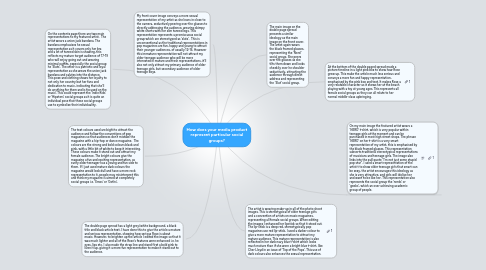
1. My front cover image conveys a more sexual representation of my artist as she leans in close to the camera, seductively peering over the glasses to directly addressing the audience, wearing skimpy white shorts with her slim tanned legs. This representation represents a promiscuous social group which are stereotyped as ‘sluts’. This is unconventional as the traditional representations in pop magazines are fun, happy and young to attract their younger audiences, of usually 12-16. However this immature representation will not attract my older teenage audience who will be more interested in mature and fresh representations, it’ll also not only attract my primary audience of older teenage girls, but secondary audience of older teenage boys.
2. The text colours used are bight to attract the audience and follow the conventions of pop magazines so that audiences don’t mistake the magazine with a hip-hop or dance magazine. The colours are the strong and bold colours black and pink, with a little bit of white to keep it interesting. These colours make it stand out and attract my female audience. The bright colours give the magazine a fun and exciting representation, as every older teenager has a young and fun side to them. If I just used mature dark colours the magazine would look dull and have a more rock representation to it, people may misinterpret this and think my magazine is aimed at completely social groups i.e. ‘Emos’ or ‘Goths’.
3. On the contents page there are two main representations to my featured artist. The artist wears a union jack bandana. The bandana emphasises he sexual representation as it covers only her bra and a lot of tanned skin is showing, this reflects my mature target audience of 17-19 who will enjoy going out and wearing minimal outfits, especially the social group he ‘Sluts’. The other is a patriotic and loyal representation as she wears the union jack bandana and salutes into the distance. This pose and clothing shows her loyalty to not only her country but her fans and dedication to music, indicating that she’ll do anything for them and is focused on the music. This could represent the ‘Indie Kids’ or ‘Hipsters’ social groups as it is quite an individual pose that these social groups use to symbolise their individuality.
4. The double page spread has a light grey/white background, a black title and black article text. I have done this to give the article a mature and serious representation, showing how serious Rose is about music. However, to brighten up the article I edited the image so that it was much lighter and all of the Rose's features were enhanced i.e. he eyes, lips etc. I also made the strap line and stand first a bold pink to liven it up, giving it a more fun representation to make it stand out to the audience.
5. On my main image the featured artist wears a ‘NERD’ t-shirt, which is very popular within teenage girls at the moment and can be purchased in most high street shops. The phrase ‘NERD’ on her t-shirt is a very smart representation of my artist, this is emphasised by the black framed glasses. This representation subverts traditional stereotypical representations of musicians and teenage girls. The image also links into the pull quote “I’m not just some stupid pop star”. I used a smart representation of the artist t to show older teenage girls that smart can be sexy, the artist encourages this ideology as she is very attractive, and girls will idolise her and want to be like her. This representation also represents the social group the ‘nerds’ or ‘geeks’, which an over achieving academic group of people.
6. The artist is wearing make-up in all of the photo shoot images. This is stereotypical of older teenage girls and a convention of artists on music magazines, representing all female social groups. When editing the images I enhanced her lipstick so that it stood out. The lip-stick is a deep red, stereotypically pop magazines use red lip-stick, I used a darker colour to give a more mature representation to attract my mature audience. This mature representation is also reflected in her dark navy blue t-shirt which looks much mature than if she wore a bright blue t-shirt, like Cher Lloyd in an issue of ‘Top of the Pops’. This use of dark colours also enhances the sexual representation.
7. The main image on the double page spread presents a similar ideology as the main image on the front cover. The artist again wears the black framed glasses, representing the 'Nerd' social group. She peers over the glasses as she tilts them down and looks cheekily over he shoulder seductively, attracting the audience through direct address and representing the 'Slut' social group.
8. At the bottom of the double paged spread made a picture timeline in a light pink box to show how Rose grew up. This make the article much less serious and conveys a more fun and happy representation, emphasised by the pink box and text. It makes Rose a very relatable character as it shows her at the beach playing with a toy at young ages. This represents all female social groups as they can all relate to her normal middle-class upbringing.


