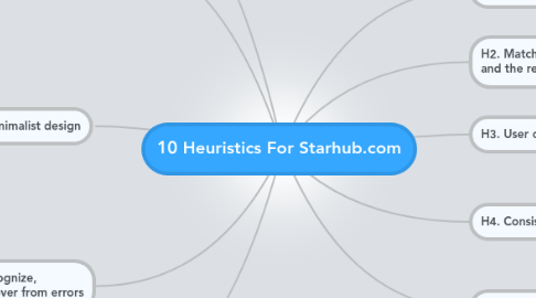
10 Heuristics For Starhub.com
by Oh Hxiing

1. H1. Visibility of the system status
1.1. All pages have proper headings, so it will not caused confusion
2. H2. Match between system and the real world
2.1. Telephone help line is green in colour with a call logo.
3. H3. User control and freedom
3.1. Users can select by clicking subheaders to specific location
4. H4. Consistency and standards
4.1. All clickable links are green in colour
4.2. All headings are either black or white in colour
5. H5. Error prevention
5.1. ipad mini and ipad is well seperated that prevent errors
6. H6. Recognition rather than recall
6.1. Headings and sub-headings are clear
7. H7. Flexibility and efficiency of use
7.1. Purchasing online is simple and easy
7.2. Location for purchase of ipad is organised by north, south, east, west and central
8. H8. Aesthetic and minimalist design
8.1. Comparison of different data plans are shown in a table form clearly.
8.2. Just by few click you can know what the difference with the different data plans offered by them
8.3. Comparison of ipads are shown clearly in a form of table
8.4. Details on ipad features are given clearly
9. H9. Help users recognize, diagnose, and recover from errors
9.1. Short description is given for each header under help section
10. H10. Help and documentation
10.1. Starhub provide links to apple website for customers' doubts or problems under a support section.
10.2. A telephone number is given under support section with a telephone logo


