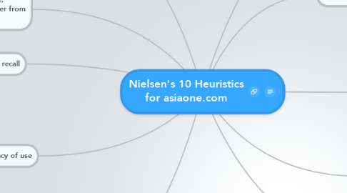
Nielsen's 10 Heuristics for asiaone.com
by RenGuo Pang

1. Recognition rather than recall
1.1. Easily able to go to the next link as the link is easily found
2. Flexibility and efficiency of use
2.1. There's advanced search functions for experienced users
2.2. No easier way of searching the countries
2.3. Currency converter has accelerators for choosing the country by typing instead of scrolling
2.3.1. An error message and a try again button will be displayed if what you're looking for is unavailable
2.3.2. There are filters to check the flight timing e.g.(origin, airline)
3. Aesthetic and minimalist design
3.1. Very direct and short words for the links
3.2. Uses charts for easy looking at different sections
3.3. Have to scroll a lot to find the country that the user is looking for
4. Help users recognize, diagnose, and recover from errors
5. Help and documentation
5.1. There are no instructions to help guide the user
5.2. There is no help or FAQ links
5.3. They have a 'from' and 'to' for saying changing which currency to which
6. Visibility of system status
6.1. There is a heading letting me know which section of the website i am at
7. Match between system and the real world
7.1. The home button is represented by a picture of a house
7.2. The words used like terminal, belt, airline are all understandable by the user
7.3. There's a bar which shows all the exchange rates and every country has it's flag beside it
8. User control and freedom
8.1. Can easily go back to the link I wanted if clicked wrongly
8.2. There is no try again option
8.3. Currency changing allows redo-ing
9. Consistency and standards
9.1. Some of the links do not bring you anywhere
9.2. The home option is not given on every page
9.3. Sometimes the service has a drop box but sometimes it doesn't
10. Error prevention
10.1. They do not ask to confirm the correct place or timing


