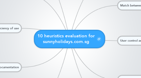
10 heuristics evaluation for sunnyholidays.com.sg
by Denise Lin

1. Visibility of system status
1.1. When click on the rates for cruises, the pages are numbered
1.2. For the e-brochures pages are numbered and when the pages are loading there is a notification at the bottom
2. Match between system and the real world
2.1. Beside the hotline there is an icon of a telephone
2.2. The e-brochures are designed similar to books in real life
3. User control and freedom
3.1. At the home page, the banner changes automatically without the user
3.2. At the rates of cruises page, there are panels advertising for Thailand and when hover above pop-up comes up
4. Consistency and standards
4.1. At the bottom of the home page there are book a tour, hotel, cruise and flight buttons which are all similar to group them into a category
4.2. When the e-brochures are open all of them are in the same size and format side by side for easier viewing
5. Error prevention
5.1. At the pop-up for rates of cruises, when clicking the scroll column, the next page button is clicked instead
5.2. At the pop-up for sharing the e-brochure by email when click clear, when clear clicked all details are removed misleading for users
6. Recognition rather than recall
6.1. Beside the hotline there is an icon of a telephone
6.2. The e-brochures are designed similar to books in real life
7. Flexibility and efficiency of use
7.1. The rates of the cruises are link when click on one the user can go to the one before and after
7.2. When opened the e-brochures after zooming in, the user is able to go to the next page without zooming out
8. Help users recognize, diagnose, and recover from errors
8.1. When looking at the rates for cruises, there are icons at the bottom but when hover above does not show what each represents
9. Help and documentation
9.1. Contact number is available at the top of the page easily visible to users
9.2. At the bottom there are pop-ups which are more needed by users like how to book and make payments
10. Aesthetic and minimalist design
10.1. On the home page there are many small panels showing different countries distracting for users
10.2. Many tabs are linked to the same site confusing for users
10.3. Able to close the tab at the bottom and open when the user wishes to


