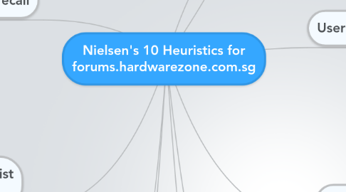
Nielsen's 10 Heuristics for forums.hardwarezone.com.sg
by Wilfred Loy

1. Recognition rather than recall
1.1. Image of product can be added by user for better description of product
1.2. Instructions on purchase of items is not stated
1.3. Information on items category are clearly separated and stated
2. Flexibility and efficiency of use
2.1. To comment, users would have to make an account and sign in, which is a 3 step process.
2.2. There is no prompt box to confirm posting of comments
2.3. Site has headers that leads to different section of web, easy to user and differentiate
2.4. Different item categories are listed for users easy navigation
3. Aesthetic and minimalist design
3.1. Contents and headers are nicely separated, easy to navigate
3.2. Item content are often well summarise, not much scrolling is needed
3.3. Many different function in one web, might confuse user.
4. Help users recognize, diagnose, and recover from errors
4.1. If site hang, users would have to restart what they are doing, for example writing a comment or thread post.
4.2. Reason for error will be prompted if site crash
5. Help and documentation
5.1. Help or contact links are all at the bottom, user who didn't scroll all the way down might not see it
5.2. Sufficient and clear help links are provided to get in touch help
6. Visibility of system status
6.1. Pages have headers that keeps users informed
6.2. There is no short guide telling user's on how to purchase or bid for items.
7. Match between system and the real world
7.1. Image of how the real product looks like is shown
7.2. Description of product is provided by user
8. User control and freedom
8.1. Social Media advert at side of webpage may cause confusion to user
8.2. Most function can only be access after logging in
8.3. Undo and Redo function is supported if clicked or selected something wrong
9. Consistency and standards
9.1. All URL links are highlighted in blue
9.2. There are login icons at the top regardless of which page your in
9.3. There are links to their other social media pages or account at the top regardless of which page your at.
9.4. Different pages you go to have different advert at the side, for example "Suggested Read, Social Media", this might confuse the user
9.5. Search bar for the webpage is at the top regardless of which page your at
10. Error prevention
10.1. Some images can be click to view larger image, some can't
10.2. Some images direct to links while some enlarges the images.
10.3. Users are prompt to log in first before they post a bid for purchase as confirmation


