
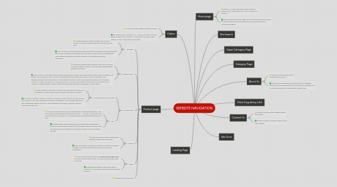
1. Product page
1.1. Call Back
1.1.1. Customer doesn't get an instant call. Sometimes have to wait for several days/weeks before getting a call back.
1.1.2. Give an idea of a timeline within which request will be dealt, give approximate times when customer can expect the call (even if 9am to 5pm on weekdays) and propose alternative contact methods if not called back within timeframe.
1.2. Enquiry forms
1.2.1. Customer doesn't get an instant reply to his enquiry. Sometimes have to wait for several days/weeks before getting a call back.
1.2.2. Give an idea of a timeline within which request will be dealt, give approximate times when customer can expect the call (even if 9am to 5pm on weekdays) and propose alternative contact methods if not contacted back within timeframe - all this within the email. Send reminder email within 24h to push to contact us, either via phone or call back function. Provide some reasons (very busy, peak season, give number of people within contact center) to show the customer Towergate is a busy place.
1.3. Quote & Buy
1.3.1. Customer becomes a lead
1.3.1.1. When customer becomes a lead, he is called back. For the case of Mardons, 2 times, then receive an email to push for contact.
1.3.1.2. The email received contains a reference number on the subject, and an enquiry form. Body of the email should be reviewed completely. Call message should not say "Towergate Marine Insurance" but Towergate Insuraance, mention enquiry was made online, etc.
1.3.2. Buy
1.3.2.1. Improve quote & buys overall and especially checkout experience. Very poor emails sent through the purchase journey - 1 quote confirmation and one purchase confirmation - no mention policy documents are to be sent later.
1.3.2.2. Review emails sent through the journey (quote confirmation + purchase confirmation emails), mention when policy document will be sent and precise where to find claims number if cannot display number.
1.4. Phone
1.4.1. Desktop numbers are too expensive, openning hours very restrictive.
1.4.2. Why not change all desktop numbers by mobile numbers? Change call center openning hours to fit customers availabilities.
1.5. Email
1.5.1. Email link that sends emails to [email protected] - not very friendly inbox name. Not sure of the value of the email link.
1.5.2. Evaluate the usage of the email feature, remove it if not used or improve name of email address.