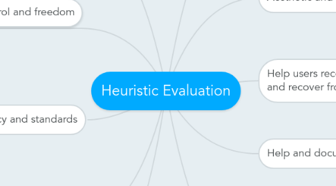
Heuristic Evaluation
by happy cat

1. User control and freedom
1.1. There is a Home tab on top of the page so user can easily go back to their home page
1.2. There is no back button for users to go back to their previous page . Thus making the user to redo everything from the beginning again
2. Consistency and standards
2.1. There are many menubar in different fonts and size
2.2. There are some unrelated things in the webpage like a rocket truck .
2.3. There are always a video of their staff singing everything u go to any of their page .
3. Error prevention
3.1. Everything on the website is so dis-organise that user will have a hard time knowing what went wrong
3.2. No clear instruction on telling the user what to do
4. Recognition rather than recall
4.1. When user is in the contact section , they will be a big header of the word 'contact' on the middle of the page which allow the user to know that where they are
5. Visibility of system status
5.1. There are alot of many moving and distracting pictures , colours , headers and tabs menu bar that makes the page very confusing
5.2. Important information such as their address , price , email and contact number are too small for user to see .
6. Match between system and the real world
6.1. Got big fonts and a arrow to tell us about where to find their contact
6.2. Have map to tell us where to find the place
6.3. Their contact information is at the bottom right instead of being in the middle of the page .
6.4. Their information isn't being organised properly
7. Flexibility and efficiency of use
7.1. The user is require to scroll down the page for quite a while before being able to see the contact information.
7.2. Writing the user information and request is very close to the sent button.
8. Aesthetic and minimalist design
8.1. There are some irrelevant information under the contact section
8.2. There are many menu bar in different size and all over the place
8.3. The information given is too small for users to read
9. Help users recognize, diagnose, and recover from errors
9.1. No error will appear even if the user enter the email wrongly
10. Help and documentation
10.1. There is a frequently asked question at the side and it can keep track of which question u had seen
10.2. Only need 6 steps to finish the task
10.3. There are helps and direction to help user to understand what to do


