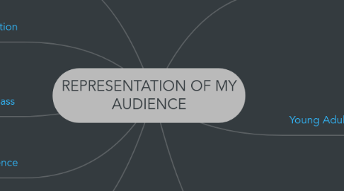
REPRESENTATION OF MY AUDIENCE
by Chrissie K

1. Ethnicity/Culture
1.1. The cover will attract a pre-dominantly black community. I attempted to attract a multicultural community but I have only used black models in my magazine and I would have liked to use a wider range of ethnicities to attract a wider audience. The cover star is black so black viewers will be intrigued as they feel empowered and as they can relate. The music genre is R & B which is traditionally a black culture, but have turned very mainstream.
2. Location
2.1. I have represented a Londoner in my DPS, as shown in the header. Purchasers will mostly be from the UK as the magazine would be retailed here. R & B is a strong culture in America due to the large, growing black population; media is mainstream and technology such as apps and online PDFs could allow my magazine to travel to other states. Also, I refer global artists on the cover lines, who are from the United States and strong in R & B so, generally, that would attract a broad span of a black audience.
3. Social Class
3.1. In the magazine I present a working class cover star by interviewing her about her deprived background but she works hard to get to a successful position in life where she no longer has to struggle. The magazine is quite aspirational with the way the front cover has been styled, her body language and attire.
4. Unisex Audience
4.1. The background shade is burgundy shade like the masthead. This could be attractive to both genders.
5. Journalism
5.1. I use a little bit of journalism here by taken professional looking photos and captioning them on my contents page
5.2. In my DPS is included here again with: headlining, pictures, quotation and report speech & opinions.
6. Femininity
6.1. The masthead is a pinkish tone and pink is stereotypically a feminine colour. The font that I use for the selling line and date is Edwardian and this can be seen as quite elegant and ladylike. Then the cover star is a female and this will automatically send messages to a viewer that it is magazine for girls. The title itself can add to the femininity; the term ‘idol’ automatically makes you think of a dominant female, for example, Beyoncé. In my DPS her name top is brings a ladylike feel with its decorative design, as well as the introduction line which indicates some sort of femininity with the word “girl”. The background tones leans more to a womanly side but is not overly girly. The masthead is a pinkish tone and pink is stereotypically a feminine colour. The font that I use for the selling line and date is Edwardian and this can be seen as quite elegant and ladylike. Then the cover star is a female and this will automatically send messages to a viewer that it is magazine for girls. The title itself can add to the femininity; the term ‘idol’ automatically makes you think of a dominant female, for example, Beyoncé.
6.2. In my DPS her name top is brings a ladylike feel with its decorative design, as well as the introduction line which indicates some sort of femininity with the word “girl”. The background tones leans more to a womanly side but is not overly girly.
7. Young Adult & Late Teens
7.1. The simplicity of the font in general makes the cover look non-dramatic and modest which targets mature young people. Youth slang, fact file, quotation,
7.2. In my DPS, the simplicity of the text, colours, layout, designs, again, is not overly dramatic, like not with swirly writing and bright colours. This targets them in accurate way because it’s balanced – not too boring and not too childish, as they not exactly the most mature either. I also use a Q & A format because it easier and quicker to read; this makes it less boring and encourages them to read further. I use a little bit slang and fillers, such as – like…, you know? Yeah etc… because it’s for a younger audience and this kind of language – they are familiar with.
8. My magazine definitely portrays a positive representation of R & B because it empowers it by bringing attention to positive aspects of its artistry, emotions and system, for instance, Beyoncé speaking on how she performs the ways she does (as a cover line). Due to the feminine nature of the magazine, this could be a negative representation of male R & B music as they are not talked about as much.


