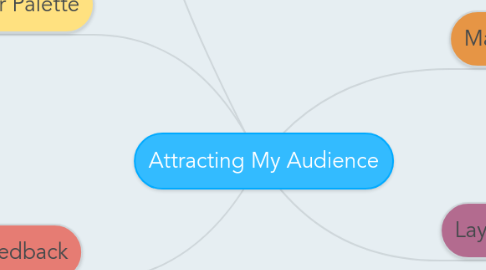
Attracting My Audience
beth sturgessにより

1. Masthead
1.1. The big bold letters, are very conventional, so that means that they are easily seen and read.
2. Layout
2.1. In terms of rule of thirds, the main image takes up all of the centre third, so it is easy to recognise who she is.
2.2. The left and right third are more text based, so attention is taken to their after the image.
3. Colour Palette
3.1. These are stereotypically 3 colours, consisting of white, black and a bright, bold colour.
3.2. Yellow is very eye catching against the white/black
4. Feedback
4.1. I got feedback from my classmates, who told me that adding in the yellow text anchorage in my double-page spread is a good idea, because it emphasises the points being made in it.
4.2. I was also told that my images in my draft pages don't work very well, so I changed this and did another photoshoot in order to fulfil the audience requests as they are the ones who it is being made for
4.3. When choosing the colour to go with on my colour palette, I asked around my friends, and fellow media students for their opinions and input, most of them agreed that yellow stood out and was effective
5. Improvements
5.1. Although I am pleased with how my products turned out, I think I would change the layout a bit on my cover page if I did it again, because I think it could have an edgier look to it, as it could represent more of a fashion/gossip magazine.


