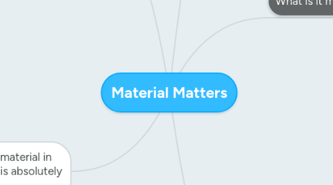
1. Interaction
1.1. Notable effort to hold the Book
1.2. Reading it creates an experience as due to its size and composition its not ergonomic.
1.2.1. Design Over Function
1.3. Kept On a shelf with my other Books
1.3.1. Reaching up to get it
1.4. People often pick it up to look through it
1.5. Use it as a catalogue to find the specific stock I need
1.5.1. Navigation system in place to help with this
1.5.1.1. Considered and designed by someone
2. What is it made of?
2.1. Different Types of paper:
2.1.1. Originally From Trees
2.1.1.1. Potential Environmental Damage
2.1.1.2. Cellulose
2.1.1.2.1. Tiny bales of hay
2.1.1.2.2. Mulch
2.1.2. Other Plant Matter
2.1.3. Oil for Plastic
2.2. Possibly Plastics
2.3. Other Plant material
2.3.1. Fabrics
2.3.1.1. Cotton
2.3.1.2. Linen
2.3.1.3. Felt
2.3.2. Spent Brewers Grain
2.3.2.1. ( Specifically GMUND Bier Collection )
2.4. Glue
2.5. Dyes
2.5.1. Natural or Un-natural?
2.6. Glitter
2.7. Ink
3. How does its material effect me
3.1. Appealing object
3.1.1. Good Weight
3.1.2. Lots of textures for tactile pleasure
3.1.2.1. We are physical beings so it perhaps makes sense for us to identify and express our values using physical objects, which we like to feel touch and smell as we read
3.1.2.1.1. Miodownik, M.A. (2013) pg 59
3.1.3. Asthetically Apealing
3.1.3.1. Well Designed
3.1.3.1.1. Appeals to my design sensibilities
3.1.3.1.2. Has and interesting enough Key & Layout to engage the reader through quite a difficult task
3.1.3.2. Colourful
3.1.3.3. Interesting textures
3.1.4. Interesting Talking Point
3.1.4.1. Looks good on the shelf with my design books
3.1.4.1.1. Implies Knowlage of Print design Improving my professional image
3.1.4.1.2. It is a good object to sum up my infatuation with print design
3.2. Nice Object to Own
3.2.1. Especially for free
3.3. Encourages & Inspires me to experiment with different stocks
4. Additional density makes paper card
4.1. Where is this used
4.1.1. Tickets
4.1.2. Business Card
4.1.3. Packaging
4.1.3.1. Glossy Treatment allows it to hold wet foods
4.2. Why is this used
4.2.1. Sense of authority
4.2.2. Longevity
4.2.3. Durablity
5. The consideration of the material in the realm of print design is absolutely crucial
5.1. This can completely change the perceived value and message that the piece communicates
5.1.1. Thicker stock communicates durability and importance
5.1.1.1. Proffessional
5.1.1.2. Used in Tickets and certificates ( documents of importance)
5.1.1.3. Thicker stock enables printing techniques such as debossing, embossing
5.1.2. Textured Stock can communicate a natural or handmade aesthetic
5.1.2.1. Ecofriendly
5.1.2.2. Artisanal
5.1.2.3. DIY
5.1.2.4. Personal
5.1.2.5. Further enhanced through coloured stock Brown & Green - Natural Asthetic
5.1.3. Lower GSM stock can communicate cheapness or informality
5.1.3.1. Association with batch printing
5.1.3.2. Also links to DIY
5.1.3.2.1. Zine and Punk Movements
5.1.3.3. Unproffessional
5.1.4. Glossy & Matte consideration
5.1.4.1. Improves perceived value
5.1.4.2. More associated with Editorial Design
5.1.4.3. Used in packaging to elevate quality
5.1.4.4. Neutral Colours & Printing techniques used to enhance quality - SpottGloss, Foiling, Debossing

