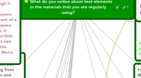
What do you notice about text elements in the materials that you are regularly using?
by Terence Cavanaugh

1. I notice that the text is usually just in black. I would like some colors to make it easier for reading, especially for the important words or headlines ~M.Alqarawi
1.1. Having multiple color would be good for the glossary and dictionary. Or even having vocabulary words in red to stress importance. ~L. Stroman
2. I've noticed in undergraduate mathematics texts, such as College Algebra, that exercise sets will contain different types of exercises such as mechanical, application, writing, critical thinking, group, and preview or summative to name a few. In order to group these exercises together, the labeling of the types are clearly shown with a larger font when compared to the exercises and consistent color choice for the exercise type. This visual organizing tool allows a faculty to quickly focus in on the a homework assignment given his/her specific objectives for that section. H. Howard
3. I have noticed when an important concept is being conveyed through text it is often in bold letters. - Jana Wilkinson
4. I have noticed that things are often done with "cute" fonts because people think it makes it more fun to read. Well, it does make it more hard to read and not fun! I have always made sure to have materials in my classroom available in user-friendly fonts, especially since I have a visually impaired student. Marla Hollan
5. Most of the novels I read I have noticed that the text is usually easy to read as it is in an understanding font with spaced widely between the words, the chapters headings and the titles are always in bigger bold fonts. I would like to see more photos combined with the text though. Nehaya Alhamed
6. In the military (Army), not much variation of fonts or color is utilized when it comes to any type of correspondence. And although bolding and italicizing is used in all correspondence letterhead, the use of it in the body is greatly discouraged. What is taught to use when it comes to official correspondence is that easy to read fonts and sizes afford the individual a greater chance to clearly and concisely understand the material they are reading. In typed correspondence, no color other than black is authorized and when signing the document only black or blue ink is authorized. As far as font size, only size 12 or 10 is accepted. I can most certainly see the benefits of such guidelines when preparing official correspondence, however, most if not all of Army regulations are written under the same guidance and it’s not always the most beneficial way to present informational documentation. Many regulations are hundreds and hundreds of pages all the same font style, size and color. I think it would be beneficial to perhaps change some of the styles of headings, titles, subtitles, ect, to provide a more guided sense of orientation throughout the document.—Ingrid Marrero-Mateo
7. I like to see a variety of colors and font sizes to keep attention. Pictures are always helpful to draw attention. Ghaliah Shuki
8. Make a few sentences or a few words in bold as a good means to emphasize the importance. Shatha Almohanna
9. I have noticed that it is getting harder for me to read small print and that lighting, spacing and color contrast are becoming more important. Also the way text is designed and broken up improves readability for me. Joy Carriger
10. Use clear texts with a large font give me assist to get the information what I want. Meshal Benhomaid
11. Instead of all capitals, I prefer to read sentences with regular capitalization. However, as an international student, it is hard for me to read in cursive script, since I have difficulty distinguishing the letters from each other. I feel colors, pictures, and double spacing make the text organized and attractive. Manal Alshebeili
12. I have found that I much prefer simplicity over creativity with text. When I see people using lots of fancy texts or crazy colors, I find it makes things more difficult to read.
12.1. Lately I have been finding that there is a very little text on each page with a huge picture. Something else that surprised me was that the text's readability was much lower than the grade the text was designed for (i.e. a 5th grade textbook had text at a 2nd grade reading level. - April Wallace
13. I noticed that I tend to give priority to articles that have bold headings and small paragraphs. I also scan text for bulleted lists to get an idea for the content first before reading the surrounding content. Lisa Dudley
14. I work with primary students and find I need to have clear type, but they enjoy using and reading from fonts like comic sans, kristen and other similar. One area we have been working on is recognizing text with different fonts. As a reader and student, the same font and text size gets old, and hard to read at times. Kristen Marotta
15. I noticed that when I have to read something written with very small text size I tend to skim through it and not to read every single sentence. Same situation happens with spacing: when I am in front of a book that has absolutely no space between a line and the other, it turns out to be absolutely horrible to read. The spacing and text size techniques that I learned in this session are definitely useful. Moira Pileri Blanco
16. I notice that the materials that I use for school do not care about the text readability or style. I usually have a lot of material that has limited spacing and smaller print. I have also noticed different styles on texts as well. I do know that I don't usually read the material if it is not spaced very well and if it is small print. Elizabeth Johnston
17. I find that I pay a lot of attention to font types. I prefer to read things that are in “neutral fonts” like Calibri, Arial, Franklin Gothic and other similar fonts. I believe that choosing the appropriate font is as important as choosing spacing or font size. I prefer fonts that clean and allow the reader to quickly make out the letters without ambiguity. - John Carter
18. I notice that reading designed text materials in which text concepts such as font type, font size, color, spacing, underlying, etc. are considered are much easier. These concepts affect the readability of the text. However, such concepts should not be overused because they might distract the reader. Areej Alfozan
19. I think the text that usually read are easy on the eyes. Most of the text I read are online, which could contribute to the brightness of the screen. As for some textbooks though, if I see small font and an entire page with no breaks, it becomes discouraging. It makes it feel like a chore. -Ryan Duzon
20. Like others have mentioned, I tend to gravitate towards text that is "clean" looking and easy to navigate. I also prefer text that is accompanied by pictures and possibly a summary paragraph. That way, if time is limited or if I am unsure about the appropriateness of the text, I can read a quick snapshot of what they text is mainly about. -Marissa Harrer
21. I read a lot of academic articles for my job, and I notice that they use small, illegible and often unreadable serif fonts in a single-column, justified format. They seem to defy all rules we've learned in this session and appear to be designed to be visually uninteresting and ultimately inaccessible. N. Seaton
22. I notice that graphics and many of colors in stories are so important to attract children's attention furthermore text size and font type will help them to read easily by themselves . Areej Alshamrani
23. I notice an easy to read font with large letters, bold letters, and different color letters to help text stand out and easy to read. T Cavanaugh
24. Most people do not take the time to make their information exciting with the use of fonts and color. Keith Gaston
24.1. That's right! I agree. Moira Pileri Blanco
25. I notice that line spacing, text size and font type can really make a difference on reading ease.-Vanessa Carswell
26. I notice that Educational Journal Articles do not take text into consideration for readability and style. They are all uniform with one-another and much more difficult to read than magazine articles that play with the use of text and color throughout their work. - Jillian Hartshorne
27. Recently for my reading tasks from my textbooks, I started to notice many things that involve the text, like the font type, size, the margin of the page, the design of the page, the heading, the highlighted parts, and other things. I think that all of these elements are essential in any book. Designing those elements should be related to the topic of the textbook, the readers of the of the textbook, the intended goals of the textbook. Saleh Alghamdi
28. I notice the use of various colors, font sizes, and graphics. I found that the new version of Math textbooks I taught to my students are more appealing to them especially with the use of related images to the topics which was not the case with the old books. Faris Aljuaid
29. I notice that using multi font size and color assist students’ comprehension. Also, adding pictures in each chapter attract readers’ attention. Abeer Alsaied
30. In the texts that I am regularly using for myself, I notice that the text tends to be small and written in sections. Being in grad school has really strained my eyes! For the text that I use with my students, I notice that the text tends to be a little bit larger and more colorful. -Yvonne Samuels


